
This article is an excerpt from the Shortform book guide to "How to Lie With Statistics" by Darrell Huff. Shortform has the world's best summaries and analyses of books you should be reading.
Like this article? Sign up for a free trial here .
What can you learn from the How to Lie With Statistics book? What are the ten techniques that liars use to manipulate statistics? How can you assess if a statistic is reliable?
In his book How to Lie With Statistics, Darrell Huff explains how people (advertisers, companies, anyone with an agenda) can manipulate numbers to yield statistics that support their cause. Since these people aren’t actually lying, it isn’t considered illegal. Huff teaches you what to look out for and how to see through liars.
Continue on for more on How to Lie With Statistics.
How to Lie With Statistics
When searching for the truth, statistics are appealing—they seem like hard, believable numbers, and they’re necessary for expressing certain information, such as census data.
However, statistics aren’t as objective as they seem. In the How to Lie With Statistics book, author Darrell Huff explains how people who want to conceal the truth manipulate numbers to come up with statistics that support their positions. These people—advertisers, companies, anyone with an agenda—often don’t even have to actually lie. Statistics is a flexible enough field that would-be liars can make their case with implications, omissions, and distraction, rather than outright falsehoods.
Not all bad statistics are manipulations or lies, of course. Some are produced by incompetent statisticians; others are accidentally misreported by media who don’t understand the field. However, because most mistakes are usually in favor of whoever’s citing the statistic, it’s fair to assume that a lot of bad statistics are created on purpose.
In this summary, you’ll learn the techniques shady characters use to lie (or imply) with statistics. You’ll also get a five-step questionnaire for evaluating the legitimacy of statistics you come across.
Technique #1: Misleading With Bad Sampling
To get their numbers, honest statisticians count a sample of whatever they’re studying instead of the whole (counting the whole would be too expensive and impractical) and take steps to make sure the sample’s make-up accurately represents the whole. They do this by making sure the sample is large (this reduces the effects of chance, which only has a negligible impact on large samples) and random (every entity in the group must have an equal chance of being part of the sample).
On the other hand, liars purposely take samples that don’t accurately represent the whole to engineer the results that they want. Or, they take small samples so that chance gives them the results they want.
- For example, if a liar wants to say that her toothpaste reduces cavities, she might ask 12 people with healthy teeth (as opposed to a group of people with a variety of dental health levels) to start using it. If this group of 12 doesn’t show any reduction in cavities, she can try the same experiment with another group of 12. Since the only possible outcomes of using toothpaste are getting more cavities, fewer cavities, or the same number of cavities, eventually the 12-person sample will by chance all (or mostly) hit on a reduction in cavities. This is much less likely to happen in a sample of, say, 120 people.
Techniques #2-6: Fudging the Numbers (or the Point)
Technique #2: Citing Misleading “Averages”
Liars often use the word “average” without specifying what kind of average a figure represents. For instance, they may use it to refer to mean—the number that’s the result of adding up all the sample’s numbers and then dividing by the number of samples.
- (Shortform example: To get the mean income of five people, you’d add up all their incomes and divide by five: 30,000+30,000+50,000+60,000+70,000=48,000.)
Giving the mean is advantageous for liars because it hides large inequalities.
- (Shortform example: If 90 employees at a company are paid $20,000 a year and the boss is paid $200,000, the mean pay is ((90*20,000)+(1*200,000))/91=21,978. The mean hides that one person is paid a lot more than everyone else.)
In turn, hiding that they’re using the mean, by simply using the word “average” to describe the figure, benefits liars by obscuring the fact that they’re using such an unreliable calculation.
Technique #3: Giving Precise Figures to Appear More Reputable
Another number-fudging technique is to include a decimal in a statistic to make a figure look more precise and therefore reputable. Liars can engineer decimals by doing calculations (for example, calculating the mean) on inexact figures that weren’t measured to the decimal point.
- (Shortform example: If you ask 100 people how much they spent on groceries in the last month, they probably won’t remember exactly. Even if they give you round, approximate numbers, if you calculate the mean, you’ll likely end up with a decimal. For instance, (20+30+60)/3=36.66666… This number is meaninglessly more precise than the measures you started with, but it looks good.)
Technique #4: Using Percentages to Hide Numbers and Calculations
Like decimals, giving percentages instead of raw figures can make numbers look more precise and reputable than they really are. (Shortform example: If two out of three people prefer a certain cleaning product, this can be expressed as 33.333…%. The decimal adds precision and implies reputability.)
Here are some additional ways liars manipulate percentages and their associated terms for their gain:
1. Hiding raw numbers and small sample sizes. Percentages don’t give any indication of the absolute value of raw figures, so liars can use them to mask unfavorable numbers or suspiciously small sample sizes.
- (Shortform example: If a stock was worth $1 yesterday and $2 today, that’s a 100% increase, which looks impressive. However, the actual difference is only $1, which looks unimpressive.)
2. Using different bases. Because percentages don’t give any indication of the raw figures (bases) used to calculate them, liars can compare percentages calculated off different bases to distort their results.
- For example, The New York Times once reported that after taking a 20% cut last year, union workers got a 5% raise the next year, which gave them back one-fourth of their cut wage. This claim of it being one-fourth of their cut wage refers to 5% being one-fourth of 20%. However, the workers didn’t actually get 5% of their original wage back, they got a 5% increase on their new, lower wage, which is a smaller number. The 20% cut and the 5% increase were calculated off different bases, so weren’t directly comparable.
3. Adding up percentages. Percentages aren’t numbers—you can’t meaningfully add or subtract them.
- For example, imagine you buy 20 vegetables at the grocery store and all of them cost you 5% more than they did last year. If you add together all of those 5% increases, you get a 100% increase (20*5%=100%). This could be reported as “the cost of living has gone up by 100%.” But in reality, it hasn’t—it’s gone up by 5%, and all products were affected.
4. Giving percentage points instead of percentages to confuse people. Percentage points are the difference between two percentages. For instance, the difference between 5% and 7% is two percentage points. If a liar doesn’t want to report how much money her company made, and her return on investment was 3% last year and 6% this year, she might say “return on investment rose three percentage points.” A three-point increase sounds much smaller than a doubling, even though they mean the same thing in this case.
Technique #5: Omitting Statistical Qualifiers
The last way to fudge numbers is to leave out information that puts caveats on their accuracy or further explains them. There are four types of information liars often neglect to include with their figures:
1. Probable error. Probable error is a measure of how reliable a figure is, expressed as a range that the true result will fall between. (It’s impossible to find the single number that represents the true result because measuring systems aren’t perfectly accurate.) Therefore, if you’re presented with a single figure, and aren’t given any indication of how accurate it is, it may not be accurate at all.
- For example, if an IQ test has a probable error of 3 and you score 98, this means that your IQ is somewhere between 95-101 (98-3=95, and 98+3=101). The real number is equally likely to be any number in that range. So, simply telling someone that your IQ is 98 isn’t accurate.
2. Degree of significance. The degree of significance is a measure of how likely it is that results are due to chance. In most cases, for a figure to be statistically significant, the degree needs to be no more than 5%—this means that 95 out of 100 times, the results are real and not attributable to chance. If the degree isn’t given, it may be higher than 5%, which means the results could be due more to chance than anything else.
3. What the comparison is to. Some stats promise to “triple” the effectiveness of a product, or offer “25% more,” but don’t say what they’re compared against. A granola bar that contains 25% more protein than a competitor’s, versus a bar that contains 25% more protein than a rock, are two entirely different things.
4. Negligibility. While there may be mathematical differences between figures, sometimes, these differences are so small they don’t make any practical difference—but liars fail to point this out.
- For example, one brand of cigarette may contain a slightly smaller amount of poisonous compounds than another. It’s still toxic.
Technique #6: Citing Semi-Related Figures
If liars can’t find a calculation that gives them figures they like, another technique they use is to focus on other figures that do seem to support what they have to say: in other words, to fudge the point. If they can’t prove something, sometimes, they’ll prove something else that sounds like it’s the same as what they were trying to prove.
- For example, if a cold medicine company can’t prove that their drug cures colds, but they can prove that it kills germs in a lab, they might advertise that their medicine “kills 15,000 germs.” Killing germs isn’t the same as curing colds (colds probably aren’t even caused by germs), but they’re close enough that people might think the medicine actually works.
Technique #7: Attributing Correlation to Causation
This technique involves pushing the idea that if there’s a relationship between two factors, one of them caused the other, and whichever factor is most favorable to a liar’s argument is the cause.
- For example, one study found that smokers got lower grades in college. A non-smoking activist with an agenda might report this as “If you stop smoking, your grades will improve.”
This is misleading because:
1. It’s often impossible to know which factor is the cause and which is the effect.
- For example, people struggling with the stress of bad grades could be driven to smoking for relief: In other words, bad grades could be the cause of smoking, not the effect of it.
2. Both factors may be effects of some other cause. While the relationship between the factors is real, the cause-and-effect is uncertain.
- For example, maybe the same people who smoke are the same people who have low grades because they like socializing more than studying.
3. The relationship between the two factors may be only due to chance.
4. Even if there is a real cause-and-effect relationship, that doesn’t mean it applies to everyone. Correlations are tendencies.
- For example, while it’s fairly conclusive that people who get a post-secondary education have higher incomes than those who don’t, that doesn’t mean that you will make more money if you go to college than if you don’t.
5. Correlations can be caused by humans and trends, rather than the factor you think they’re caused by.
- For example, older women tend to walk with their toes farther apart than younger women. This is because posture trends changed over the years, not because women’s posture necessarily changes as they age (which is what some people may assume).
Techniques #8-10: Manipulating Images
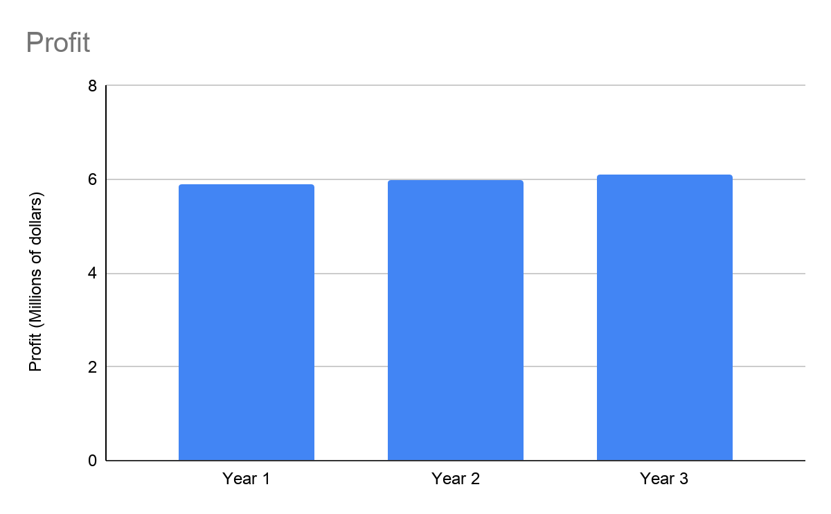
Technique #8: Truncating Graphs or Add More Divisions to the Y-Axis
To make changes look larger than they are, liars remove the empty space on a graph so that the part the data occupies is the only part shown. This will make the slope of a line look steeper, or the difference between bars look greater.
- For example, from this graph, it’s obvious that there’s little difference in profit from year-to-year:

In this graph, which uses the same data as the first graph but has more divisions and has been truncated, profit looks significantly different from year to year:

Technique #9: Failing to Include Labels and Numbers on Graphs
If diagrams and graphs don’t have labels or numbers, it’s impossible to know what they show.
- For example, one advertising agency presented a graph that showed a steadily rising line. The y-axis showed time in years, but the x-axis had no label. Presumably, it was profit, but without further labeling, it was impossible to know if profits were jumping by millions or cents.
Technique #10: In Bar Graphs, Using Illustrations Instead of Bars
In a bar chart, the height of the bar is what indicates the measurement. If you replace a bar with an illustration, when you increase the height of the illustration, all the other dimensions scale proportionally. Increasing the width and depth (if 3-D) of the image makes the differences between the two images—and thus the differences between what the images represent—look much larger than they really are.
- (Shortform example: In the illustration below, the skulls represent the death rate from a certain illness. Before a liar’s medication was adopted, the death rate was 60 out of 1 million, represented by a skull at height 60. After adoption, the death rate halved to 30, represented by a skull at height 30. However, visually, the rate appears to have dropped by far more than half because the image appears to have decreased by more than half: The whole image was scaled proportionally, rather than just the height being halved.)
Death rate pre-adoption:💀Death rate post-adoption:💀
Assessing the Legitimacy of Statistics
In the previous sections of the How to Lie With Statistics book, you learned liars’ techniques for misrepresenting statistics. Now, you’ll learn about a five-question checklist you can go through every time you encounter a statistic to assess its legitimacy. The goal is to find balance—you don’t want to swallow statistics without thinking about them (it’s often worse to know something wrong than to be ignorant), but you also don’t want to be so suspicious that you ignore all statistics and miss out on important information.
Here are the evaluation questions:
1. What is the source of the statistic? The first thing to do when confronted with a statistic is to figure out where it’s coming from. If the source might have an agenda, you should be suspicious of the statistic. (Note that liars often borrow the numbers of reputable organizations, such as universities or labs, but come to their own conclusions using those numbers. Then, then try to make it look like their conclusion is the reputable organization’s conclusion, to give their conclusion more credibility. Check if the organization that provided the numbers is the same one that provided the conclusions drawn from them.)
2. What was the data collection method? Any data that’s based on what respondents say, or how motivated they are to respond to a survey, can skew the truth. When confronted with a statistic that was calculated based on people’s responses, ask yourself if there were any reasons the respondents might have been motivated to lie.
- For example, one census in China, for military and tax purposes, found the population of one region to be 28 million. The next census, for famine relief purposes, found the population of the same region to be 105 million. The population hadn’t changed much over the five years in between censuses—people were just a lot keener to be counted when it meant famine relief than when it meant getting taxed.
3. Is any relevant information omitted? Figures exist in context. If a figure is cited on its own, ask yourself if there is other relevant information that might qualify the figure further, and if leaving that information out would further anyone’s interests.
- For example, an environmentalist who wants the government to regulate pollution might cite a high death rate during pollution-driven foggy weather in London and attribute the deaths to the fog. However, this doesn’t represent how the world works—people die for plenty of reasons that don’t have anything to do with the weather, and the high death rate could have been caused by something else. A more accurate statistic would be to cite the death rate accompanied by the cause of death: This would show how many people truly died due to fog.
4. Is the language surrounding the figures misleading? Study the words surrounding the figure and consider their definitions (to twist their results to suit their argument, liars may not use the most common definition of an everyday word, as you learned with “average”).
- (Shortform example: Anything can be the “first,” “biggest,” or “best” of its kind, depending on how people define these words. For instance, the “biggest” waterfall in Canada is Niagara Falls (if “big” means the largest volume of water falling) or Della Falls (if “big” means highest).)
5. Does the statistic make sense? Ask yourself if whatever the statistic reveals seems right, if it conflicts with any well-known facts, or if it’s suspiciously precise.
- For example, one urologist calculated that there are eight million cases of prostate cancer in the US. At the time, the male population of the US was less than eight million, which meant the figure couldn’t be accurate.
———End of Preview———
Like what you just read? Read the rest of the world's best book summary and analysis of Darrell Huff's "How to Lie With Statistics" at Shortform .
Here's what you'll find in our full How to Lie With Statistics summary :
- The 10 ways you might end up fooled by statistics
- How to differentiate between legitimate and lying statistics
- Why you can't even trust a graph


")


” If two out of three people prefer a certain cleaning product, this can be expressed as 33.333…%. The decimal point isn’t the problem in this example. Two thirds is twice one third.