
This article is an excerpt from the Shortform summary of "Factfulness" by Hans Rosling. Shortform has the world's best summaries of books you should be reading.
Like this article? Sign up for a free trial here .
What are the different types of curves you can graph? How do the curves differ from each other? We’ll cover curves, with examples from real world statistics.
It’s useful to remember that statistical trends follow many different types of curves, not just a straight line. As people move from Level 1 to Level 4, these trends follow different patterns.
Type of Curve 1: S-Bend Curves
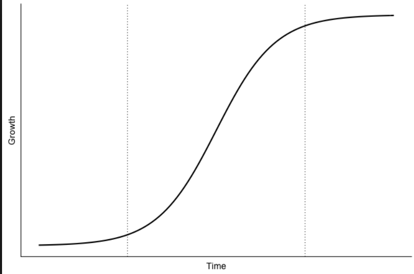
These types of curves are low and flat at Level 1, rise sharply at Level 2, and flatten off at Levels 3 and 4. Trends that follow this type of curve include female literacy, vaccination rates, and refrigeration.
This is because once people reach Level 2 they can afford these luxuries and start consuming them en masse. But the increase slows down in Levels 3 and 4 because everybody already has them by then.
Type of Curve 2: Slide Curves
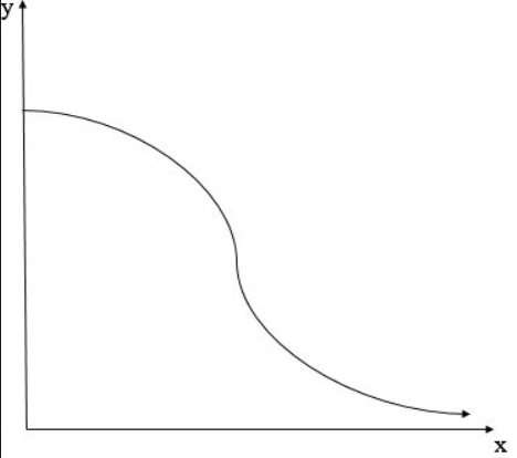
These curves are the inverse of S-Bends: flat at Level 1, a sharp decrease at Level 2, and then a flattening at Levels 3 and 4. A significant example of a phenomenon that follows a slide curve is babies-per-woman. Women have fewer kids as they get more access to contraception and escape extreme poverty in the transition from Level 1 to Level 2. But children born at Levels 3 and 4 are less likely to have fewer kids, so the rate of decrease drops.
Type of Curve 3: Hump Curves
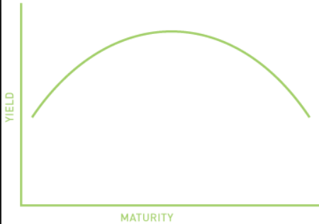
Hump curves are low at Level 1, rise sharply at Levels 2 and 3, and decline again at Level 4.An interesting example of a trend that moves along a hump curve is cavities. People can’t afford sweets at Level 1, so they have fewer cavities. As they get richer, they can start to afford candy and soda, but not dental care, so cavities peak at Levels 2 and 3. By Level 4, however, people are wealthy enough to afford adequate dental care, so cavities decline once again.
Type of Curve 4: Doubling Curves
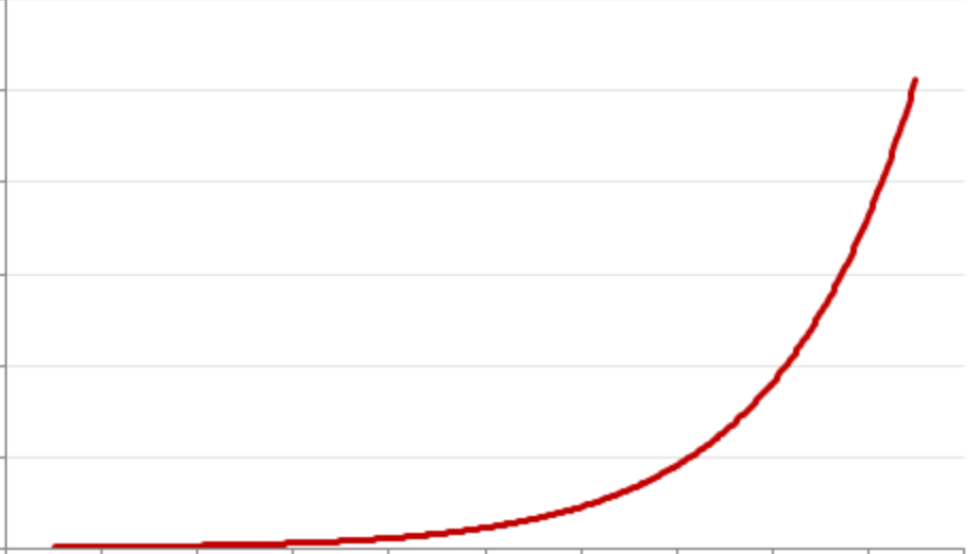
This type of curve shows an exponential increase from Level 1 to Level 4. Examples include distance, spending, and CO2 emissions. The reason is that all of these are directly correlated with income. The more money you have, the more you will travel, spend, and contribute to emissions. However, the effect of money is different at all levels: the marginal increase of $1 is life-changing at Level 1, but fairly meaningless at Level 4.
———End of Preview———
Like what you just read? Read the rest of the world's best summary of Hans Rosling's "Factfulness: Ten Reasons We're Wrong About the World" at Shortform . Learn the book's critical concepts in 20 minutes or less .
Here's what you'll find in our full Factfulness summary :
- Why we evolved to be negative, and why it's terrible for us today
- Surprising statistics about how people die - from plane crashes to swine flu
- How the world isn't nearly as poor as you think it is
- How to think smarter about the world, and the rest of life
")


