
This article is an excerpt from the Shortform book guide to "101 Design Methods" by Vijay Kumar. Shortform has the world's best summaries and analyses of books you should be reading.
Like this article? Sign up for a free trial here.
What’s the importance of mapping innovation? How can you use maps to discover what you need to work on in your company?
One of Vijay Kumar’s favorite innovation tools he describes in his book 101 Design Methods is the two-factor cluster map. The map may reveal important relationships or opportunities if you find that the dots cluster together in some areas while other regions of the plot are empty.
Let’s look at how mapping innovation works, using the seven tasks of innovation that Kumar highly recommends following.
Two-Factor Cluster Maps
Arguably Kumar’s favorite tool (based on how many variations of it he presents and the scope of what he applies it to) is mapping innovation. To create a two-factor cluster map, label the two axes of a scatter plot with properties you want to compare. Then, mark on the plot where different products or services you’re researching fall.
For example, you might make a two-factor map comparing the price and user base of a certain type of service, as shown below:
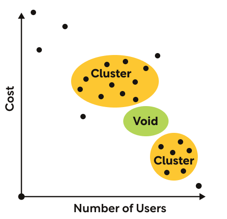
In the example plot, the services you’re comparing are concentrated into two clusters: one at a very low price point and one at a moderately high price point. Between these two clusters is an empty region with no offerings. Maybe that void indicates an opportunity in an uncontested region of the market. Or maybe there’s a good reason that no offerings exist in that region. You’ll need more information to figure out why the voids and clusters exist, but the plot allows you to tell at a glance where they exist.
Applications for Two-Factor Cluster Maps
Kumar suggests several uses for two-factor cluster maps in the seven tasks of innovation:
- Develop a clear idea of what you intend to accomplish
- Define your operating environment
- Understand your stakeholders
- Develop a mental model
- Brainstorm solution elements
- Assemble and evaluate comprehensive solutions
- Plan to implement the solution
In Tasks 1 and 2, he recommends plotting companies and their offerings on maps with different combinations of factors to explore the dynamics of the industry and identify areas of opportunity. Sometimes you can gain additional insights by plotting competing products as dots and complimentary products as x’s or c’s (or any other marker that distinguishes them from competing products) on the same plot.
In Tasks 3 and 4, he suggests plotting users against different combinations of two factors (for example, age, level of income, frequency of use, how long they’ve been using the product, or their likelihood of renewing their subscription) to identify clusters of similar users. These clusters can serve as a starting point for building user profiles.
In Task 6, Kumar recommends plotting your solutions or solution elements with the value they would provide to the user on one axis and the profits they would provide to the company on the other axis. Seeing graphically how much value each solution provides to whom may make it obvious which solutions are most worth pursuing.
Comparing More Than Two Factors
As we just discussed, Kumar’s cluster maps allow you to easily and visually compare any two quantitative aspects of something across a set of options or offerings. But what if you’ve got more than two factors that you need to compare? You could make a whole series of two-factor cluster maps, comparing every combination of factors, but putting together the results of all those different comparisons would still require additional analysis.
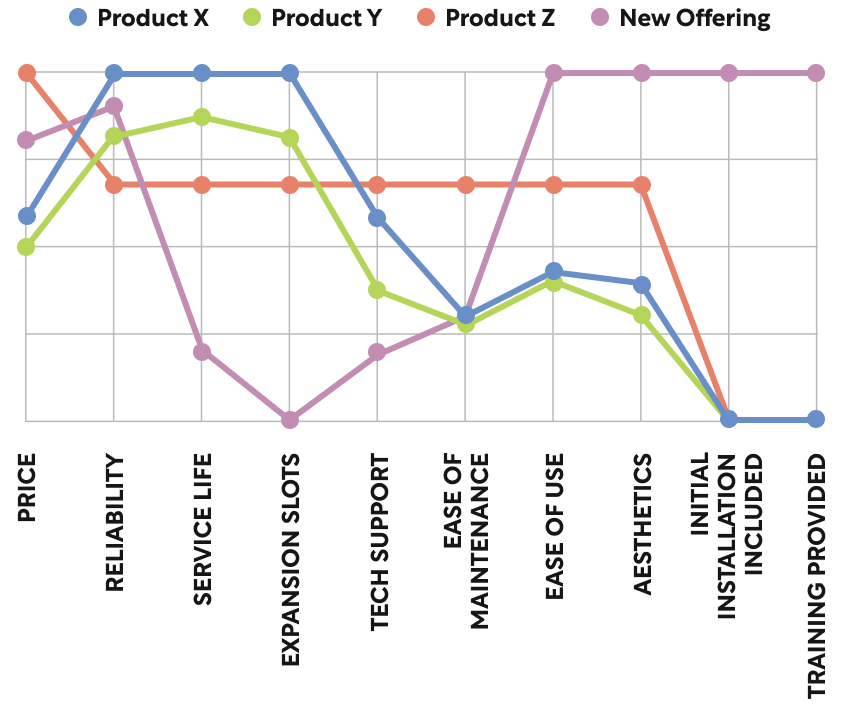
A better option might be to use the “strategy canvas” that Kim and Mauborgne present in Blue Ocean Strategy. This alternative comparison tool lets you visually assess the relationship between any number of options using any number of quantifiable factors: You list the factors at regular intervals on the horizontal axis and record the magnitude of each factor for each option with a dot. Then you connect all the dots that represent the same option, creating a profile curve for that option.
Just as a two-factor plot shows similar options clustering together, options that are similar across several factors will have profile curves that closely follow each other. For example, on the strategy canvas below, Product X and Product Y are clearly very similar offerings.
Kim and Mauborgne present their strategy canvas specifically as a tool for comparing aspects or features of a product so you can come up with a new offering that is clearly differentiated from existing products. But, like Kumar’s two-factor cluster map, the tool could be used to compare almost anything in principle.
In Tasks 1 and 2, you might plot profile curves for all the companies in your industry, comparing things like their volume of sales, warehouse capacity, manufacturing capabilities, environmental footprint, and so forth. Much like clustering on a two-factor plot, if you find that many of them have similar profiles, that could indicate either universal constraints or untapped opportunities.
In Tasks 3 and 4, you might plot profile curves for different users with factors like age, income, frequency of use, and so forth to see if there are similar patterns in how all these factors relate to each other across different users. Or you might collect metrics on users’ proficiency with different applications of a product and plot the numbers for each user against the different applications. If you find that many of the profile curves dip down on certain applications, that would alert you to pain points that are common to many users.
And in Task 6, you could plot a profile curve for each of your stakeholders, showing how much value they would get from each element of the solution. This would show you at a glance which stakeholders will likely have similar interests and which ones may have conflicting interests when it comes to choosing the elements of the final solution.
———End of Preview———
Like what you just read? Read the rest of the world's best book summary and analysis of Vijay Kumar's "101 Design Methods" at Shortform.
Here's what you'll find in our full 101 Design Methods summary:
- Why many companies don’t understand how to manage innovation
- A systematic approach to innovation management
- Specific tools and techniques you can use on innovation projects


")
")