We've ranked the best typography books using expert recommendations, sales data, and millions of reader ratings. At Shortform, we know books. Our book guides are the best in the world. Learn why.
Cover unavailable
1
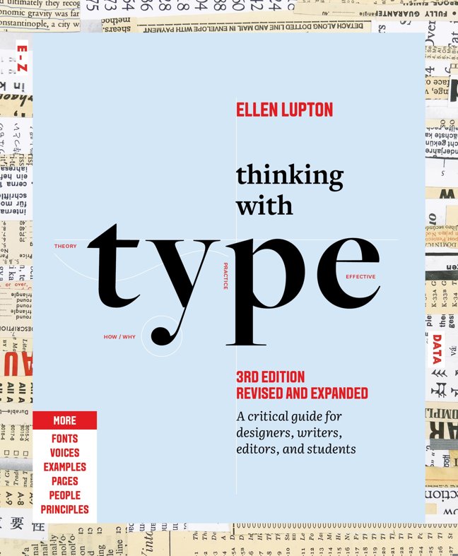
Thinking With Type
Ellen Lupton
5.0
Our all time best selling book is now available in a revised and expanded second edition. Thinking with Type is the definitive guide to using typography in visual communication, from the printed page to the computer screen. This revised edition includes forty-eight pages of new content, including the latest information on style sheets for print and the web, the use of ornaments and captions, lining and non-lining numerals, the use of small caps and enlarged capitals, as well as information on captions, font licensing, mixing typefaces, and hand lettering. Throughout the book, visual examples show how to be inventive within systems of typographic form—what the rules are and how to break them. Thinking with Type is a type book for everyone: designers, writers, editors, students, and anyone else who works with words. The popular online companion to Thinking with Type (www.thinkingwithtype.com) has been revised to reflect the new material in the second edition.

…
Recommended by David Kadavy, Kimberly Gloria Choi, Marius Ciuchete Paun, and 1 others.
Kimberly Gloria Choi
When asked what books she would recommend to youngsters interested in her professional path, Kimberly mentioned Thinking with Type. [source]
Marius Ciuchete Paun
Question: What books would you recommend to young people interested in your career path? Answer: “Just My Type” by Simon Garfield “Thinking with Type” by Ellen Lupton “Don't Make Me Think” by Steve Krug “Geometry of Design” by Kimberly Elam “Grid Systems in Graphic Design” by Josef Müller-Brockmann “ReWork” by Jason Fried These titles should be a good start, I think. [source]
Cover unavailable
2
The Elements of Typographic Style: Version 4.0
Robert Bringhurst
5.0
Renowned typographer and poet Robert Bringhurst brings clarity to the art of typography with this masterful style guide. Combining the practical, theoretical, and historical, this edition is completely updated, with a thorough revision and updating of the longest chapter, "Prowling the Specimen Books," and many other small but important updates based on things that are continually changing in the field.
…
Recommended by David Kadavy.
Cover unavailable
3
Just My Type: A Book About Fonts
Simon Garfield
4.7
What’s your type? Suddenly everyone’s obsessed with fonts. Whether you’re enraged by Ikea’s Verdanagate, want to know what the Beach Boys have in common with easy Jet or why it’s okay to like Comic Sans, Just My Type will have the answer. Learn why using upper case got a New Zealand health worker sacked. Refer to Prince in the Tafkap years as a Dingbat (that works on many levels). Spot where movies get their time periods wrong and don’t be duped by fake posters on eBay. Simon Garfield meets the people behind the typefaces and along the way learns why some fonts – like men – are from Mars and some are from Venus. From type on the high street and album covers, to the print in our homes and offices, Garfield is the font of all types of knowledge.
…
Recommended by Marius Ciuchete Paun.
Marius Ciuchete Paun
Question: What books would you recommend to young people interested in your career path? Answer: “Just My Type” by Simon Garfield “Thinking with Type” by Ellen Lupton “Don't Make Me Think” by Steve Krug “Geometry of Design” by Kimberly Elam “Grid Systems in Graphic Design” by Josef Müller-Brockmann “ReWork” by Jason Fried These titles should be a good start, I think. [source]

Cover unavailable
4
Stop Stealing Sheep & Find Out How Type Works
Erik Spiekermann, E.M Ginger
4.6
A guide to typography. It draws in the reader with its design and layout, making use of more than 200 illustrations and photographs. It explains in everyday layman's terms what type is and how you can use it to enhance legibility, meaning, and aesthetic enjoyment. It also includes chapters on Web typography and other forms of online text display.
This book helped me see design differently. Good design costs just as much as bad design, but it breaks through all sorts of clutter. [source]
Debbie Millman
The great typographer Eric Spiekermann’s book. [source]
Cover unavailable
5
Typography Sketchbooks
Steven Heller, Lita Talarico
4.6
Typography is an obsession for most designers. It's at the heart of all visual communication and is one of the purest forms of design, one that can always be improved and refined. Typography Sketchbooks gets into the minds of designers who create typefaces, word images and logos through their private sketchbooks. The result of these wide-ranging typographic musings provide fascinating insights into the expressive quality of letters and words. Aimed at all those who use type, whether by hand or on-screen, this pleasing compendium stresses the importance of good typography at a time when reading habits are changing and celebrates a craft that has endured for centuries.
…
Cover unavailable
6
The New Typography
Jan Tschichold, Ruari McLean, Robin Kinross
4.5
Since its initial publication in Berlin in 1928, Jan Tschichold's The New Typography has been recognized as the definitive treatise on book and graphic design in the machine age. At once a key theoretical document of Central European modernism between the world wars and an invaluable source of working principles for the practicing designer, this classic work enjoys the reputation among book artists that Le Corbusier's Toward a New Architecture has long held among architects.
The book's legendary renown is certain to increase with the long-overdue appearance of this first English translation, published in a form that reflects Tschichold's original typography and design. Ranging from theoretical discussions of typography in the age of photography and mechanical standardization to practical considerations in the design of business forms, The New Typography remains essential reading for designers, art historians, and all those concerned with the evolution of visual communication in the twentieth century.
…
Recommended by David Kadavy.
Cover unavailable
7
Designing Type
Karen Cheng
4.5
An indispensable new guide for developing and designing typefaces
One of the most essential tools of graphic design, typography influences the appearance of visual print materials perhaps more than any other component. This essential book explains the processes behind creating and designing type. Author Karen Cheng discusses issues of structure, optical compensation, and legibility, with special emphasis given to the often overlooked relationships between letters and shapes in font design.
The book is illustrated with numerous diagrams that demonstrate visual principles and letter construction, ranging from informal progress sketches to final type designs and diagrams. A wide range of classic and modern typefaces is analyzed, including those from many premier contemporary type foundries. Introductory essays and diagrams emphasize the history of type, the primary systems of typeface classification, the two main proportional systems for type, the parts of a letter, the effects of new technology on design methodology, the optical illusions that affect density and balance in letterforms, and the differences in form between basic serif typestyles. The book provides detailed guidelines for creating serif and sans serif letters, numbers, punctuation, and accents.
As design clients increasingly call for original and custom typefaces, Designing Type is a superb reference for both students and professional graphic designers.
…
Cover unavailable
8
The Anatomy of Type
Stephen Coles, Erik Spiekermann
4.5
Students and professionals in any creative field can benefit from a good typographic eye. The Anatomy of Type (The Geometry of Type in the UK) is all about looking more closely at letters. Through visual diagrams and practical descriptions, you’ll learn how to distinguish between related typefaces and see how the attributes of letterforms (such as contrast, detail, and proportion) affect the mood, readability, and use of each typeface. Nutritional value aside, the spreads full of big type are nice eye candy, too.
The 100 typefaces featured in the book are hand-picked by the author for their functionality and stylistic relevance in today’s design landscape. Along with several familiar faces (Garamond, Bodoni, Gill Sans, Helvetica), you’ll also discover contemporary fonts that are less common — and often more useful — than the overused classics.
…
Recommended by Fabio Sasso.
Cover unavailable
9
Designing with Type: The Essential Guide to Typography
James Craig and Irene Korol Scala
4.5
The classic Designing with Type has been completely redesigned, with an updated format and full color throughout. New information and new images make this perennial best-seller an even more valuable tool for anyone interested in learning about typography. The fifth edition has been integrated with a convenient website, www.designingwithtype.com, where students and teachers can examine hundreds of design solutions and explore a world of typographic information. First published more than thirty-five years ago, Designing with Type has sold more than 250,000 copies—and this fully updated edition, with its new online resource, will educate and inspire a new generation of designers.
…
Cover unavailable
10
In Progress: See Inside a Lettering Artist's Sketchbook and Process, from Pencil to Vector (Hand Lettering Books, Learn to Draw Books, Calligraphy Workbook for Beginners)
Jessica Hische, Louise Fili
4.4
This show-all romp through design-world darling Jessica Hische's sketchbook reveals the creative and technical process behind making award-winning hand lettering. See everything, from Hische's rough sketches to her polished finals for major clients such as Wes Anderson, NPR, and Starbucks. The result is a well of inspiration and brass tacks information for designers who want to sketch distinctive letterforms and hone their skills. With more than 250 images and metallic silver ink printed throughout to represent her penciled sketches, this highly visual book is an essential—and entirely enjoyable—resource for those who practice or simply appreciate the art of hand lettering.
…
Recommended by Jason Santa Maria, Jessica Hische, and 2 others.
Cover unavailable
11
Detail In Typography
Jost Hochuli
4.4
How is it that text can be set perfectly and yet look insufferably dull? How do you achieve perfect congruence between the type itself and its meaning? In Detail in Typography Jost Hochuli, master book designer and author of the seminal Designing Books, addresses the finer points of setting text. Hochuli begins with a consideration of how human beings read, moving on incrementally to considerations of letter, word, and line as well as word-space and line-space. Hochuli concludes by examining whole paragraphs and how they carry meaning. Produced in Switzerland to the highest standards, Detail in Typography embodies critical thinking and articulate design in its own physical form.
…
Cover unavailable
12
The Complete Manual of Typography: A Guide to Setting Perfect Type
james felici
4.4
Note to customers: The print version of this book is highly formatted, and many pages contain examples that use a variety of approaches to text layout including the use of multiple fonts. The subtleties of this layout would be lost when converted to ePub, so we have chosen to offer this ebook only in PDF format, which keeps the page layout intact.
Beautifully designed and richly illustrated The Complete Manual of Typography, Second Edition, is the fully updated version of THE seminal book on typography by Jim Felici. This book is about how type should look and how to make it look that way -- in other words, how to set type like a professional. It explains in practical terms how to use today's digital tools to achieve the secret of good design: well set type. An essential reference for anyone who works with type: designers, print production professionals, and corporate communications managers can go to straight to the index to find focused answers to specific questions, while educators and students can read it as a text book from cover to cover. You'll Learn: Basic Concepts and anatomy of good typography, indexed for quick reference by busy professionals How to manage fonts and handle corrupted or missing fonts on any operating system What makes good type good (and bad type bad) Techniques for working with measure, point-size, leading, kerning, and other type fundamentals Practical ways to fix composition problems such as loose lines, bad rags, windows, and orphans Hard-to-find rules for managing hyphenation and justification, indents, text wraps, and expert-set characters Secrets of how to wring out good type from uncooperative word-processing and layout problems The latest font technologies, including OpenType New typographic tools and improved font services in Operating Systems such as Windows and Mac OS New Techniques, and coverage of working methods such as style sheets. 35 page glossary of type terms Praise for the first edition
"Clear and elegant... There's no better or more useful introduction to the whole craft of typography"
Roger Black - Danilo Black, Inc
"All you've wanted to know about type and typography but never dared ask. Jim Felici brings together a vast amount of knowledge in this book. Must-Have!"
Erik Spiekermann author, Stop Stealing Sheep (and Find Out How Type Works)
…
Cover unavailable
13
Type Matters!
Jim Williams, Ben Casey
4.4
Once upon a time, only typesetters needed to know about kerning, leading, ligatures, and hanging punctuation. Today, however, most of us work on computers, with access to hundreds of fonts, and we’d all like our letters, reports and other documents to look as good – and as readable – as possible. But what does all the confusing terminology about ink traps, letter spacing, and visual centring mean, and what are the rules for good typography? Type Matters! is a book of tips for everyday use, for all users of typography, from students and professionals to anyone who does any layout design on a computer. The book is arranged into three chapters: an introduction to the basics of typography; headline and display type; and setting text. Within each chapter there are sections devoted to particular principles or problems, such as selecting the right typeface, leading, and the treatment of numbers. Examples throughout show precisely what makes good typography – and, crucially, what doesn’t. Authoritatively written and designed by a practitioner and teacher of typography, Type Matters! has a beautifully clear layout that reinforces the principles discussed throughout.
…
Cover unavailable
14
Typographic Systems of Design: Frameworks for Type Beyond the Grid (Graphic Design Book on Typography Layouts and Fundamentals)
Kimberly Elam
4.3
Typographic organization has always been a complex system in that there are so many elements at play, such as hierarchy, order of reading, legibility, and contrast. In Typographic Systems, Kim Elam, author of our bestselling books, Geometry of Design and Grid Systems, explores eight major structural frameworks beyond the gridincluding random, radial, modular, and bilateralsystems. By taking the reader through exercises, student work, and professional examples, Elam offers a broad range of design solutions. Once essential visual organization systems are understood the designer can fluidly organize words or images within a structure, combination of structures, or a variation of a structure. With clarity and substance, each systemfrom the structured axis to the nonhierarchical radial arrayis explained and explored so that the reader comes away with a better understanding of these intricate complex arrangements. Typographic Systems is the seventh title in our bestselling Design Briefs series, which has sold more than 100,000 copies worldwide.
…
Cover unavailable
15
Grid Systems in Graphic Design/Raster Systeme Fur Die Visuele Gestaltung (German and English Edition)
Josef Müller-Brockmann
4.3
Recommended by Marius Ciuchete Paun.
Marius Ciuchete Paun
Question: What books would you recommend to young people interested in your career path? Answer: “Just My Type” by Simon Garfield “Thinking with Type” by Ellen Lupton “Don't Make Me Think” by Steve Krug “Geometry of Design” by Kimberly Elam “Grid Systems in Graphic Design” by Josef Müller-Brockmann “ReWork” by Jason Fried These titles should be a good start, I think. [source]
Cover unavailable
16
Type: A Visual History of Typefaces and Graphic Styles (Volume 1, 1628-1900)
Jan Tholenaar, Cees De Jong
4.3
This book offers a novel overview of typeface design, exploring the most beautiful and remarkable examples of font catalogs from the history of publishing, with a special emphasis on the period from the mid-19th century to the mid-20th century, when color catalogs were at their height. Taken from a Dutch collection, this exuberant selection traverses the evolution of the printed letter in all its various incarnations via exquisitely designed catalogs displaying not only type specimens in roman, italic, bold, semi-bold, narrow, and broad, but also characters, borders, ornaments, initial letters and decorations as well as often spectacular examples of the use of the letters. The Victorian fonts, sumptuous and sometimes unbelievably outrageous, are accorded a prominent place in this book. In addition to lead letters, examples from lithography and letters by window-dressers, inscription carvers, and calligraphers are also displayed and described.
Featuring works by type designers including: William Caslon, Fritz Helmuth Ehmcke, Peter Behrens, Rudolf Koch, Eric Gill, Jan van Krimpen, Paul Renner, Jan Tschichold, A. M. Cassandre, Aldo Novarese, Adrian Frutiger
In order to include a vast amount of material, we have divided this text into two volumes. The first volume displays pre 20th Century type specimens, and the second covers the period from 1900 to the middle of the century. In the first volume, editor Cees de Jong and collector Jan Tholenaar write about single specimens and types; in the second, Alston Purvis outlines the history of types.
…
Cover unavailable
17
A Type Primer
John Kane
4.3
Practical and hands-on in approach, this book/exercise manual speaks clearly to beginning graphic designers and others involved with type about the complex meeting of message, image, and history surrounding typography.
Cover unavailable
18
Shady Characters: The Secret Life of Punctuation, Symbols & Other Typographical Marks
Keith Houston
4.3
From ancient Greece to the Internet—via the Renaissance, Gutenberg, and Madison Avenue—Shady Characters exposes the secret history of punctuation.
A charming and indispensable tour of two thousand years of the written word, Shady Characters weaves a fascinating trail across the parallel histories of language and typography. Whether investigating the asterisk (*) and dagger (†)--which alternately illuminated and skewered heretical verses of the early Bible--or the at sign (@), which languished in obscurity for centuries until rescued by the Internet, Keith Houston draws on myriad sources to chart the life and times of these enigmatic squiggles, both exotic (¶) and everyday (&).
From the Library of Alexandria to the halls of Bell Labs, figures as diverse as Charlemagne, Vladimir Nabokov, and George W. Bush cross paths with marks as obscure as the interrobang (‽) and as divisive as the dash (--). Ancient Roman graffiti, Venetian trading shorthand, Cold War double agents, and Madison Avenue round out an ever more diverse set of episodes, characters, and artifacts.
Richly illustrated, ranging across time, typographies, and countries, Shady Characters will delight and entertain all who cherish the unpredictable and surprising in the writing life.
…
Cover unavailable
19
Typographic Design: Form and Communication
Rob Carter, Ben Day, Philip B. Meggs
4.3
For more than two decades, the type book of choice for design professionals and students
Typographic design has been a field in constant motion since Gutenberg first invented movable type. Staying abreast of recent developments in the field is imperative for both design professionals and students. Thoroughly updated to maintain its relevancy in today's digital world, Typographic Design: Form and Communication, Fourth Edition continues to provide a compre-hensive overview of every aspect of designing with type, now in full color.
This Fourth Edition of the bestselling text in the field offers detailed coverage of such essential topics as the anatomy of letters and type families, visual communications and design aesthetics, and designing for legibility. Supplementing these essential topics are theoret-ical and structural problem-solving approaches by some of the leading design educators across the United States. Unwrapping the underlying concepts about typographic form and message, Typographic Design, Fourth Edition includes four pictorial timelines that illustrate the evolution of typography and writing within the context of world events - from the origins of writing more than 5,000 years ago to contemporary Web site and electronic page design.
New features include:
Full-color treatment throughout
A new ancillary Web site containing resources for self-learners, students and professors (www.typographicdesign4e.com)
Two new chapters: The Typographic Grid and Typographic Design Process
An updated design education section that includes recent examples of projects assigned by leading design educators
New case studies that showcase design for Web sites and animated typography projects
Case studies detailing examples of visual identification systems, environmental graphics, book and magazine design, Web site design, type in motion, and wayfinding graphics
Updated coverage of digital type technology
…
Cover unavailable
20
The Non-Designer's Design Book (Non Designer's Design Book)
Robin Williams
4.3
A lot has happened in the world of digital design since the first edition of this title was published, but one thing remains true: There is an ever-growing number of people attempting to design everything from newsletters to advertisements with no formal training. This book is the one place they can turn to find quick, non-intimidating, excellent design help from trusted design instructor Robin Williams. This revised and expanded classic includes a new chapter on designing with type, more quizzes and exercises, updated projects, and new visual and typographic examples that give the book a fresh, modern look. In" The Non-Designer's Design Book, " "4th Edition, " Robin turns her attention to the basic principles that govern good design. Perfect for beginners, Robin boils great design into four easy-to-master principles: contrast, repetition, alignment, and proximity (C.R.A.P.!). Readers who follow her clearly explained concepts will produce more sophisticated and professional work immediately. Humor-infused, jargon-free prose interspersed with design exercises, quizzes, and illustrations make learning a snap-which is just what audiences have come to expect from this bestselling author.
…
Recommended by David Kadavy.
Cover unavailable
21
On Web Typography
Jason Santa Maria
4.3
Achieving a thorough grasp of typography can take a lifetime, but moving beyond the basics is within your reach right now. In this book, we’ll learn how to look at typefaces with a discerning eye, different approaches to typographic planning, how typography impacts the act of reading, and how to choose and combine appropriate typefaces from an aesthetic and technical point of view. Through an understanding of our design tools and how they relate to the web as a medium, we can empower ourselves to use type in meaningful and powerful ways.
This book will be released Summer 2012.
…
Recommended by Jason Santa Maria and Veerle Pieters.
Cover unavailable
22
Hand Job: A Catalog of Type
Michael Perry
4.3
In this digital age of computer-generated graphics and typography, it's refreshing to find typographers who still believe in working by hand. No longer relegated to designer's sketchbooks, hand-drawn type has emerged from the underground as a dynamic vehicle for visual communicationfrom magazine, book, and album covers to movie credits and NFL advertisements. As the practice and appreciation of hand-drawn type grows, its time to celebrate the work of those typographers whose every letterform is a work of art.Hand Job collects groundbreaking work from fifty of today's most talented typographers who draw by hand. Graphic designer and hand typographer Michael Perry selects work representing the full spectrum of design methods and styles. Each hand-drawn work is entirely shaped by the artist's unique processevery one a carefully executed composition enhanced by unplanned "accidents" of line, color, and craft. Hand Job also includes photographs of found type,artists studios, and the tools that help make typography come to life. Whether you are looking to invigorate your design work or are just in need of a little offbeat inspiration, Hand Job will have you reaching for your favorite pen.
…
Cover unavailable
23
Letter Fountain
Joep Pohlen, Geert Setola
4.3
Everything you could ever want to know about printing letters and numbers
Looking back as far as man's first efforts to communicate with visual signs and drawings, Letter Fountain is a completely unique typeface handbook: in addition to examining the form and anatomy of every letter in the alphabet (as well as punctuation marks and special characters), the book cross-references type designs with important works of art and art movements from Gutenberg's times until today. Further attention is given to the esthetics of the digital age and typographical recommendations such as the choice of the right typeface for a job. Rounding out the guide are an in-depth comparison between sans-serif and serif typefaces, an essay about measuring systems and indications, advice about typographic rules, plus a manual for developing digital fonts.
Over 150 typefaces, their origins, and font characteristics are discussed in detail, visually explained by full page tables including scale, weight, and slope increments. The extensive appendix contains a general index, one on typefaces (more than 300 are depicted in the book), an index on over 250 type designers, an exhaustive index on type founders from Gutenberg to present, a graphical dictionary, and a bibliography for further reading.
The original Dutch edition Letterfontein received a Certificate for Typographic Excellence from Type Directors Club New York (TDC) in 2010, and a red-dot design award from the Design Zentrum Nordrhein-Westfalen, Germany.
Special features include:
thoroughly hardbound in half linen with three ribbon bookmarks 144 pages appendix with resourceful glossary and indices convenient typographic ruler with conversions between four measurement systems and hidden shortcuts for your Apple keyboard!
…
Cover unavailable
24
Anatomy of a Typeface
Alexander S. Lawson
4.3
An analysis of letter forms, from Garamond and Bembo to the design and manufacture of sans-serif and newspaper type.
Cover unavailable
25
Typography for Lawyers
Matthew Butterick, Bryan A. Garner
4.3
Cover unavailable
26
Typography: Macro and Microaesthetics: Fundamentals of Typographic Design
Willi Kunz
4.3
Cover unavailable
27
Essay on Typography
Eric Gill, Christopher Skelton
4.2
Born in 1882, Eric Gill was an artist, letter carver, polemicist, and social reformer. In 1925, he had started drawing alphabets and printing books, and in 1931, this plainspoken little book was a fustian and forceful argument for common sense in design, composed for anyone remotely interested in the subtle and evolving challenge of the typographic arts. Set rag right, with tight word spacing, it is a model of composition. The text, like most of Gill's, is exasperating, exorbitant, and exciting. But Gill was, above all, a craftsman, whose work always reflected his philosophy and whose hand always followed his moral convictions.
…
Cover unavailable
28
Elegantissima: The Design and Typography of Louise Fili
Louise Fili, Steven Heller
4.2
Louise Fili has been an inspiration for designers around the world since the 1980s, when she raised the bar on book cover design, creating close to two thousand jackets as art director for Pantheon Books. In 1989 Fili founded her own graphic design studio, Louise Fili Ltd, and branched out into the fields of restaurant and food packaging design. Her lavish and elegant typography, often hand drawn, helps advertise and market such well-known brands as Sarabeth's, Bella Cucina, Jean-Georges, and Good Housekeeping, among many others. Known for her intense attention to detail, her fresh reinterpretation of vintage sources, and her passion for all things Italian, Fili has won numerous awards. Elegantissima, the first monograph on her work, covers the breadth of her nearly forty-year design career and is a must-have for graphic design students and professionals, as well as anyone interested in advertising, food, restaurants, Italy, and books.
…
Cover unavailable
29
Counterpunch: making type in the sixteenth century, designing typefaces now
Fred Smeijers
4.2
Counterpunch is both an explanation of the 16th-century method ofcutting metal type and an impassioned plea for contemporary designers to incorporate the lessons of history as a means of creating typography in our digital age. Smeijers sees the counterpunch technique as essential for ensuring the regularity of form, repeatability, and speed of production necessary for rational design.Smeijers traces the history of letterform design to discover how technique influenced the shape of type, whether the metal punches of the past or today's computer-generated forms. Counterpunch is generouslyillustrated with drawings by the author, examples of early type specimens, and detailed photographs of punches.
…
Cover unavailable
30
Typography Essentials Revised and Updated: 100 Design Principles for Working with Type
Ina Saltz
4.2
Typography Essentials: 100 Design Principles for Working with Type is a practical, hands-on resource that distills and organizes the many complex issues surrounding the effective use of typography. An essential reference for designers since 2009, Typography Essentials is now completely refreshed with updated text, new graphics and photos, and a whole new look.
Divided into four sections—The Letter, The Word, The Paragraph, and The Page—the text is concise, compact, and easy to reference. Each of the 100 principles, which cover all practical aspects of designing with type, has an explanation and inspiring visual examples drawn from international books, magazines, posters, and more.
Typography Essentials is for designers of every medium in which type plays a major role, and is organized and designed to make the process enjoyable and entertaining, as well as instructional.
…
Cover unavailable
31
Mr. Penumbra's 24-Hour Bookstore (Mr. Penumbra's 24-Hour Bookstore, #1)
Robin Sloan
4.2
The Great Recession has shuffled Clay Jannon away from life as a San Francisco web-design drone and into the aisles of Mr. Penumbra's 24-Hour Bookstore, but after a few days on the job, Clay discovers that the store is more curious than either its name or its gnomic owner might suggest. The customers are few, and they never seem to buy anything; instead, they "check out" large, obscure volumes from strange corners of the store. Suspicious, Clay engineers an analysis of the clientele's behavior, seeking help from his variously talented friends, but when they bring their findings to Mr. Penumbra, they discover the bookstore's secrets extend far beyond its walls.
…
Recommended by Brad Feld.
Brad Feld
Co-Founder/Foundry Group
Robin Sloan’s … book, Mr. Penumbra’s 24-Hour Bookstore, was my favorite book of 2013. [source]
Cover unavailable
32
Inside Paragraphs: typographic fundamentals
Cyrus Highsmith
4.2
An manual for typographers seasoned and green alike. This book goes in depth on setting tracts of text for long reading, with a strong emphasis on print.
Cover unavailable
33
The Fundamentals of Typography
Gavin Ambrose, Paul Harris
4.2
The Fundamentals of Typography offers an overview plus incisive insight into the use of type and stunning examples sure to inspire typographers and designers in the field. A comprehensive introduction to the history of typography, typographic detailing in practice, and font generation for print and the web, this book covers type in the past and the present--and speculates on the future. Basic principles are explained with detailed presentations, illustrations, case studies, and examples from leading design studios around the world.
…
Cover unavailable
34
Type and Typography
Phil Baines, Andrew Haslam
4.2
• Includes 2 extensive timecharts, one on type designers, one on the evolution of writing and printing—reference at a glance
• Newly revised and expanded
• Hundreds of remarkable photographs and illustrations
From the history of language and writing systems, to the development of letterforms and movable type, to the evolution of today’s digital systems, Type and Typography offers an overview of the typefaces available today and a practical guide to using type as a meaningful element of design in all mediums. Newly expanded with fifty additional pages of text and eighty-five new illustrations, this second edition reflects the exciting developments in typography since the first edition was published in 2002.
…
Cover unavailable
35
Grid Systems: Principles of Organizing Type
Kimberly Elam
4.2
Although grid systems are the foundation for almost all typographic design, they are often associated with rigid, formulaic solutions. However, the belief that all great design is nonetheless based on grid systems (even if only subverted ones) suggests that few designers truly understand the complexities and potential riches of grid composition. In her best-selling Geometry of Design, Elam shows how proportion, symmetry, and other geometrical systems underlie many of the visual relationships that make for good design. Now, Elam brings the same keen eye and clear explanations to bear on the most prevalent, and maybe least understood, system of visual organization: the grid. Filled with extensive research and more than 100 informative examples from the Bauhaus to Nike ads, Grid Systems provides a rich, easy-to-understand overview and demonstrates a step-by-step approach to typographic composition. It suggests design strategies that transcend simple function and reductionist recipes to allow grids to become a means of truly dynamic communication. Any designer, educator, or student will benefit greatly from this elegant slim book, chock-a-block full of colorful examples, helpful vellum overlays, and Elam's insightful analysis.
…
Cover unavailable
36
Type: A Visual History of Typefaces and Graphic Styles (Volume 2, 1901-1938)
Alston W Purvis, Cees De Jong
4.2
Cover unavailable
37
Typography Workbook: A Real-World Guide to Using Type in Graphic Design
Timothy Samara
4.2
New in paperback, The Typography Workbook provides an at-a-glance reference book for designers on all aspects of type.The book is part of Rockport's popular Workbook series of practical and inspirational workbooks that cover all the fundamental areas of the graphic design business. This book presents an abundance of information on type - the cornerstone of graphic design - succinctly and to the point, so that designers can get the information they need quickly and easily.
Whereas many other books on type are either very technical or showcase oriented, this book offers ideas and inspiration through hundreds of real-life projects showing successful, well-crafted usage of type. The book also offers a variety of other content, including choosing fonts, sizes, and colors; incorporating text and illustrations; avoiding common mistakes in text usage; and teaching rules by which to live (and work) by.
…
Cover unavailable
38
Pioneers of Modern Typography
Herbert Spencer
4.2
Graphic designers, typophiles, and students of the Modern Movement will welcome the reissue of this important source book. Since it was first published in 1969, it has served as the standard guide to the impact of twentieth century avant-garde movements on graphic design and typography. This revised edition has a more compact format and incorporates new materials and illustrations.Spencer's substantial introduction examines the origins and artifacts of the revolution in graphic design and carefully disentangles the respective influences of Futurism, Dadaism, De Stijl, Suprematism, Constructivism, and the Bauhaus. Spencer traces the interactions of the key personalities associated with these movements and presents concise biographical sketches of them.An album of color reproductions displays characteristic examples of the most important innovators' work, representing such genres as posters, magazine covers, letterheads, advertisements, and poems.Herbert Spencer is Professor of Graphic Arts at the Royal College of Art, London.
…
Cover unavailable
39
Type Rules!: The Designer's Guide to Professional Typography
Ilene Strizver
4.2
Type Rules!, Fourth Edition is an up-to-date, thorough introduction to the principles and practices of typography. From the fundamentals to cutting-edge applications, this edition has everything today's serious designer needs to use type effectively. Dozens of exercises reinforce authoritative coverage on such topics as how to select the appropriate type for the job, how to set type like a pro, and how to design a typeface, as well as how to fully harness the power of major design packages including the Adobe Creative Suite.Includes video clips showing examples of projects discussed in Chapter 11- Type on the Web and Chapter 12- Type in Motion
…
Cover unavailable
40
Scripts: Elegant Lettering from Design's Golden Age
Steven Heller, Louise Fili
4.2
From wedding announcements to IOUs, there are hundreds, perhaps thousands, of scripts—some “classic,” others eccentric. Derived from handwriting, these are typefaces that are stylized to suggest, imply, or symbolize certain traits linked to writing. Their fundamental characteristic is that all the letters, more or less, touch each other.
Scripts tend to fall in and out of fashion, but they are most definitely part of the typographic landscape today, and the more curious and distinctive they are, the better. Drawn from the Golden Age of Scripts, from the nineteenth to the mid-twentieth century, this is the first compilation of popular, rare, and forgotten scripts from the United States, Germany, France, England, and Italy.
Filled with examples from a broad spectrum of sources—advertising, street signs, invitations, type-specimen books, personal letters—the book is a delightful and invaluable trove of long-overlooked material.
…
Cover unavailable
41
Book Typography: A Designer's Manual
Michael and Susan Wightman Mitchell
4.2
Cover unavailable
42
Logo, Font & Lettering Bible: A Comprehensive Guide to the Design, Construction and Usage of Alphabets and Symbols
Leslie Cabarga
4.2
Put the power to design logos and type in your own hands!
Why be a designer who must rely upon preexisting typefaces and clip art when you can become the kind of designer who creates logos, fonts and lettering of your own? Leslie Cabarga, author of the bestselling "Designer's Guide to Color Combinations," has created a textbook of type for the experienced graphics professional as well as the beginning student of design.
You'll learn how to: Create innovative logo design traditionally and on the computerDevelop a discerning eye for quality lettering and logo designDesign your own custom-made fontsBuild a profitable business as a logo, font and lettering designer
It's the most comprehensive treatise on logos, fonts and lettering available!
The easy-to-read, fun-to-browse, picture-heavy format makes learning to letter a snap. The "Logo, Font & Lettering Bible" provides the start-to-finish information you need to succeed in today's competitive design market.
…
Cover unavailable
43
The Mac is Not a Typewriter
Robin Williams
4.2
One of the most popular Macintosh books ever written, The Mac is not a typewriter has been called the "Strunk and White of typography." Best-selling author Robin Williams's simple, logical principles for using type to produce beautiful, professional documents are as true now as they were when the original edition was published in 1989. This updated edition includes new examples and expanded information dedicated to the practical advice that made the first edition an enduring bestseller. Throughout, Robin shows you the small details that separate the pros from the amateurs: typographer versus typewriter quotation marks, en and em dashes, tabs and indents, kerning, leading, white space, widows and orphans, and hanging punctuation. If you prepare documents, you'll find The Mac is not a typewriter, Second Edition an indispensable guide. And those who read your documents will recognize the work of a pro, even if they don't know a curly quote from curly fries.
…
Cover unavailable
44
Digital Typography
Donald E. Knuth
4.1
In this collection, the second in the series, Knuth explores the relationship between computers and typography. The present volume, in the words of the author, is a legacy to all the work he has done on typography. When he thought he would take a few years' leave from his main work on the art of computer programming, as is well known, the short typographic detour lasted more than a decade. When type designers, punch cutters, typographers, book historians, and scholars visited the University during this period, it gave to Stanford what some consider to be its golden age of digital typography. By the author's own admission, the present work is one of the most difficult books that he has prepared. This is truly a work that only Knuth himself could have produced.
…
Cover unavailable
45
I Wonder
Marian Bantjes
4.1
Quirky, poignant, astute, funny—this beautiful book presents a compelling collection of observations on visual culture and design, written and illuminated by world-renowned typographic illustrator Marian Bantjes. In Stefan Sagmeister's telling words, Bantjes's work is his "favorite example of beauty facilitating the communication of meaning."
Cover unavailable
46
Better Web Typography for a Better Web
Matej Lati
4.1
Better Web Typography for a Better Web is a book is based on a top-rated online course explaining typography to people who build web sites—web designers and web developers. The author, Matej Latin, takes complex concepts such as vertical rhythm, modular scale and page composition, and explains them in a simple way. The content of the book is accompanied by live code examples and the readers design and build an example website as they go through it. This is a new typography book for a new medium, the rules haven't changed much, everything else has.
…
Cover unavailable
47
House of Leaves
Mark Z. Danielewski
4.1
Years ago, when House of Leaves was first being passed around, it was nothing more than a badly bundled heap of paper, parts of which would occasionally surface on the Internet. No one could have anticipated the small but devoted following this terrifying story would soon command. Starting with an odd assortment of marginalized youth—musicians, tattoo artists, programmers, strippers, environmentalists, and adrenaline junkies—the book eventually made its way into the hands of older generations, who not only found themselves in those strangely arranged pages but also discovered a way back into the lives of their estranged children.
Now, for the first time, this astonishing novel is made available in book form, complete with the original colored words, vertical footnotes, and newly added second and third appendices.
The story remains unchanged, focusing on a young family that moves into a small home on Ash Tree Lane where they discover something is terribly wrong: their house is bigger on the inside than it is on the outside.
Of course, neither Pulitzer Prize-winning photojournalist Will Navidson nor his companion Karen Green was prepared to face the consequences of that impossibility, until the day their two little children wandered off and their voices eerily began to return another story—of creature darkness, of an ever-growing abyss behind a closet door, and of that unholy growl which soon enough would tear through their walls and consume all their dreams.
…
Recommended by Amelia Boone.
Amelia Boone
This is a book that you have to hold, because there are parts of it where you need to turn it upside down to read it. There are certain pages where, you are reading it, and it turns in a circle... This is a book that's an entire sensory experience. [source]
Cover unavailable
48
Little Book of Lettering
Emily Gregory
4.1
Typography is always one of the designer's first considerations when it comes to making a statement, and in recent years the world of lettering and type has exploded in an unprecedented wave of creative discovery. Contemporary artists, typesetters, and designers of all kinds are exploring new horizons in illustrated and hand-drawn lettering, digitally rendered lettering, and 3D lettering. This collection—large in scope but petite in size—surveys the recent lettering renaissance, showcasing a diverse range of talent in gorgeous, eye-catching examples and profiling today's innovators. In a stunning little package that expertly combines a handmade feel with a modern aesthetic, this is the ultimate inspirational collection of contemporary lettering for design buffs and type enthusiasts alike.
…
Recommended by Fabio Sasso.
Cover unavailable
49
Type on Screen
Ellen Lupton, Maryland Institute College of Art
4.1
The long awaited follow-up to our all-time bestseller Thinking with Type is here. Type on Screen is the definitive guide to using classic typographic concepts of form and structure to make dynamic compositions for screen-based applications. Covering a broad range of technologies—from electronic publications and websites to videos and mobile devices—this hands-on primer presents the latest information available to help designers make critical creative decisions, including how to choose typefaces for the screen, how to style beautiful, functional text and navigation, how to apply principles of animation to text, and how to generate new forms and experiences with code-based operations. Type on Screen is an essential design tool for anyone seeking clear and focused guidance about typography for the digital age.
…
Recommended by Ellen Lupton.
Cover unavailable
50
The Visual History of Type: A visual survey of 320 typefaces
Paul McNeil
4.1
The Visual History of Type is a comprehensive, detailed survey of the major typefaces produced since the advent of printing with movable type in the mid–fifteenth century to the present day. Arranged chronologically to provide context, more than 320 typefaces are displayed in the form of their original type specimens or earliest printing. Each entry is supported by a brief history and description of key characteristics of the typeface.
This book will be the definitive publication in its field, appealing to graphic designers, educators, historians and design students. It will also be a significant resource for professional type designers and students of type.
Reviews "A mind–blowing catalogue of typefaces and type history… a fantastic, heavyweight compendium of letterforms that's a firm WIRED art department favourite." – WIRED magazine
"The Visual History of Type is a comprehensive, detailed survey of the major typefaces produced since the advent of printing…This book will be the definitive publication in its field, appealing to graphic designers, educators, historians and design students." – Against The Grain
"Accessible, highly readable and, moreover, a type book to pore over and simply enjoy as the history of the medium evolves chronologically from page to page." – Creative Review
"This exquisitely produced, extensively researched and extraordinarily comprehensive work is a definitive study of the history of type." – New Design
"The Visual History of Type is a beautiful book. Its arranged into hundreds of short chapters invites one to peruse it haphazardly for pleasure. Beneath its coffee–table appearance lies a genuine reference work." – The Times Literary Supplement
…
Cover unavailable
51
New Vintage Type: Classic Fonts for the Digital Age
Steven Heller, Gail Anderson
4.1
Choose, use, and understand great vintage type with this authoritative guide. Retro is the new modern. And nowhere is that fact more evident than in typography, which today uses vintage type in ads, book and magazine design, movies, and everywhere words convey meaning. Viewers may not even realize that the type itself conveys mood, information, and a sense of style, but graphic designers know the power of vintage type. Now the world’s foremost historian of graphic design presents New Vintage Type, a remarkable rethinking and rediscovery of old and classic typefaces for today’s modern needs. Hundreds of amazing, astounding, and obscure examples from around the world are gathered here, organized into five historically and stylistically grouped sections: the Victorian Age, the Woodtype Era, Art Deco Style, Modern Movement, and the Eccentric Movement. With hundreds of lively and one-of-a-kind examples, plus informed, intriguing tex, New Vintage Type is the graphic designer's guide to choosing and using vintage type for maximum impact.
…
Cover unavailable
52
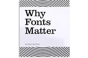
Why Fonts Matter
Sarah Hyndman
4.1
We all constantly interact with type in almost every aspect of our lives. But how do fonts affect what we read and influence the choices we make?
This book opens up the science and the art behind how fonts influence you. It explains why certain fonts or styles evoke particular experiences and associations. Fonts have different personalities that can create trust, mistrust, give you confidence, make things seem easier to do or make a product taste better. They’re hidden in plain sight, they trigger memories, associations and multisensory experiences in your imagination.
* Fonts can alter the meanings of words right before your very eyes. * See what personalities fonts have, and what they reveal about YOUR personality. * Explore how you respond to fonts emotionally and can make fonts work for your message. * Be amazed that a font has the power to alter the taste of your food.
This book is for anyone who is interested in giving words impact, who loves words and how they influence us.
…
Cover unavailable
53
Lettering & Type: Creating Letters and Designing Typefaces
Bruce Willen, Nolen Strals
4.1
No component of graphic design has attracted as much interest or inspired as much innovation in recent years as lettering and type. These fundamentals of design, once the exclusive domain of professional typographers, have become an essential starting point for anyone looking for a fresh way to communicate. Practical information about creating letters and type often amounts to a series of guidelines for executing a particular process, font program, or style. But what makes lettering and type endlessly fascinating is the flexibility to interpret and sometimes even break these rules. Lettering & Type is a smart-but- not-dense guide to creating and bending letters to one's will. More than just another pretty survey, it is a powerful how-to book full of relevant theory, history, explanatory diagrams, and exercises. While other type design books get hung up on the technical and technological issues of type design and lettering, Lettering & Type features the context and creativity that shape letters and make them interesting.
Authors and designers Bruce Willen and Nolen Strals examine classic design examples as well as exciting contemporary lettering of all stripes—from editorial illustrations to concert posters to radical conceptual alphabets. Lettering & Type is ideal for anyone looking to move beyond existing typography and fonts to create, explore, and use original or customized letterforms. This latest addition to our best-selling Design Briefs seriesfeatures a foreword by Ellen Lupton and hundreds of images and examples of work by historical and contemporary designers, artists, and illustrators, including Marian Bantjes, Stefan Sagmeister, Matthew Carter, Christoph Niemann, Steve Powers (ESPO), House Industries, Christian Schwartz, Margaret Kilgallen, James Victore, Abbott Miller, Sibylle Hagmann, Ed Fella, and many more. Throughout the book interviews with type designers, artists, and graphic designers provide real-world perspective from contemporary practitioners.
…
Cover unavailable
54
Helvetica and the New York City Subway System: The True (Maybe) Story
Paul Shaw
4.1
How New York City subways signage evolved from a "visual mess" to a uniform system with Helvetica triumphant.
For years, the signs in the New York City subway system were a bewildering hodge-podge of lettering styles, sizes, shapes, materials, colors, and messages. The original mosaics (dating from as early as 1904), displaying a variety of serif and sans serif letters and decorative elements, were supplemented by signs in terracotta and cut stone. Over the years, enamel signs identifying stations and warning riders not to spit, smoke, or cross the tracks were added to the mix. Efforts to untangle this visual mess began in the mid-1960s, when the city transit authority hired the design firm Unimark International to create a clear and consistent sign system. We can see the results today in the white-on-black signs throughout the subway system, displaying station names, directions, and instructions in crisp Helvetica. This book tells the story of how typographic order triumphed over chaos.
The process didn't go smoothly or quickly. At one point New York Times architecture writer Paul Goldberger declared that the signs were so confusing one almost wished that they weren't there at all. Legend has it that Helvetica came in and vanquished the competition. Paul Shaw shows that it didn't happen that way--that, in fact, for various reasons (expense, the limitations of the transit authority sign shop), the typeface overhaul of the 1960s began not with Helvetica but with its forebear, Standard (AKA Akzidenz Grotesk). It wasn't until the 1980s and 1990s that Helvetica became ubiquitous. Shaw describes the slow typographic changeover (supplementing his text with more than 250 images--photographs, sketches, type samples, and documents). He places this signage evolution in the context of the history of the New York City subway system, of 1960s transportation signage, of Unimark International, and of Helvetica itself.
…
Recommended by Alexandra Horowitz.
Alexandra Horowitz
This book is a really nice example of the author’s obsession with lettering on signage. [source]
Cover unavailable
55
Computers & Typesetting, Volume A: The TeXBook
Donald E. Knuth
4.1
TeX represents the state-of-the-art in computer typesetting. It is particularly valuable where the document, article, or book to be produced contains a lot of mathematics, and where the user is concerned about typographic quality. TeX software offers both writers and publishers the opportunity to produce technical text of all kinds, in an attractive form, with the speed and efficiency of a computer system.
Novice and expert users alike will gain from The TeXbook the level of information they seek. Knuth warns newcomers away from the more difficult areas, while he entices experienced users with new challenges. The novice need not learn much about TeX to prepare a simple manuscript with it. But for the preparation of more complex documents, The TeXbook contains all the detail required.
Knuth’s familiar wit, and illustrations specially drawn by Duane Bibby, add a light touch to an unusually readable software manual. The TeXbook is the first in a five-volume series on Computers and Typesetting, all authored by Knuth.
…
Cover unavailable
56
Lettering and Modern Calligraphy: A Beginner's Guide: Learn Hand Lettering and Brush Lettering
Paper Peony Press
4.1
Cover unavailable
57
Mastering Type: The Essential Guide to Typography for Print and Web Design
Denise Bosler
4.1
Good Design, Down to the Letter
Packages on store shelves, posters on building walls, pages of a website—all contain information that needs to be communicated. And at the heart of that communication is type: visually interesting, interactive, expressive and captivating. Each letter must come alive; therefore, each letter must be carefully crafted or chosen. A solid foundation in typography, as well as an understanding of its nuances, will help you optimize your visual communication—in whatever form it takes.
By breaking down the study of type into a systematic progression of relationships—letter, word, sentence, paragraph, page and screen—award-winning graphic designer and professor of communication design Denise Bosler provides a unique and illuminating perspective on typography for both print and digital media and for designers of all skill levels.
Through instruction, interviews and real-world inspiration, Mastering Type explores the power of each typographic element--both as it stands alone and as it works with other elements--to create successful design, to strengthen your skill set and to inspire your next project.
…
Cover unavailable
58
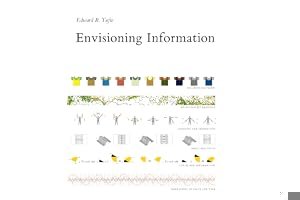
Envisioning Information
Edward R. Tufte
4.1
The celebrated design professor here tackles the question of how best to communicate real-life experience in a two-degree format, whether on the printed page or the computer screen. The Whole Earth Review called Envisioning Information a "passionate, elegant revelation."
Recommended by Kevin Rose, Jeff Atwood, Bret Victor, and 1 others.
The master when it comes to taking complicated data and turning it into beautiful charts and graphs that are easy to understand. If you’re into graphic design, print design, web design, you name it, you’re going to get some really good information and how tos out of these books. He has a whole series of these books. [source]
Cover unavailable
59
Type: The Secret History of Letters
Simon Loxley
4.1
If you've ever wondered exactly what a Zapf is, or if Baskerville has anything to do with Sherlock Holmes, Type is the answer to these questions and more. This is the story of the passions, and obsessions of the creator of type; of the influences of wars, persecution, and political upheaval, and the effects of business and technological breakthroughs on fonts and typography. From Gutenberg's first moveable type to the Internet, Simon Loxley tells the stories behind the letters, giving readers a cultural history unlike any other. After reading Type, readers will never look at the printed word in the same way again.
…
Cover unavailable
60
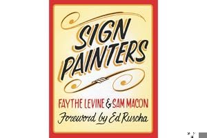
Sign Painters
Faythe Levine, Sam Macon, Ed Ruscha
4.1
There was a time-as recently as the 1980s-when storefronts, murals, banners, barn signs, billboards, and even street signs were all hand-lettered with brush and paint. But, like many skilled trades, the sign industry has been overrun by the techno-fueled promise of quicker and cheaper. The resulting proliferation of computer-designed, die-cut vinyl lettering and inkjet printers has ushered a creeping sameness into our visual landscape. Fortunately, there is a growing trend to seek out traditional sign painters and a renaissance in the trade. In 2010 filmmakers Faythe Levine, coauthor of Handmade Nation, and Sam Macon began documenting these dedicated practitioners, their time-honored methods, and their appreciation for quality and craftsmanship. Sign Painters, the first anecdotal history of the craft, features stories and photographs of more than two dozen sign painters working in cities throughout the United States.
…
Cover unavailable
61
Herb Lubalin: Art Director, Graphic Designer and Typographer
Gertrude Snyder, Alan Peckolick
4.1
Cover unavailable
62
The Complete Book of Chalk Lettering: Create and Develop Your Own Style
Valerie McKeehan
4.1
Say it with chalk! Learn the art of hand-drawn chalk lettering from an Etsy superstar in a book complete with chalkboards!
Ubiquitous at boutiques and cafés, on Etsy and Pinterest, in stationery and home decor, the art of chalk lettering is hotter than ever. Valerie McKeehan, an Etsy standout, teaches us everything we need to know to create gorgeous hand-drawn chalk designs.
In over 60 lessons, learn the ABCs of lettering (literally) and basic styles: serif, sans serif, and script. Next, how to lay out a design, combine various styles into one cohesive piece, and add shadows and dimension. Master more advanced letter styles, from faceted to ribbon to “vintage circus.” Use banners, borders, flourishes. And finally, 12 projects to show off your newfound skills, including a Winter Wonderland Snow Globe; a smartphone-themed birthday card to text friends and family; a one-of-a-kind party invitation to create, photograph, and mail; and a bake sale sign guaranteed to put everyone who sees it in the mood for a cupcake!
The book is also a practice space, with three foldout “chalkboards”—the inside cover and foldout back cover are lined with blackboard paper.
…
Cover unavailable
63
Making and Breaking the Grid: A Graphic Design Layout Workshop
Timothy Samara
4.1
For designers working in every medium, layout is arguably the most basic, and most important, element. Effective layout is essential to communication and enables the end user not only to be drawn in with an innovative design but to digest information easily. Making and Breaking the Grid is a comprehensive layout design workshop that assumes that in order to effectively break the rules of grid-based design, one must first understand those rules and see them applied in real-world projects.
Text reveals top designers' work in process and rationale. Projects with similar characteristics are linked through a simple notational system that encourages exploration and comparison of structure ideas. Also included are historical overviews that summarize the development of layout concepts, both grid-based and non-grid based, in modern design practice.
…
Cover unavailable
64
ABC3D
Marion Bataille
4.1
"Easily the most innovative alpabet book of the year, if not the decade... Beyond clever."—The Washington Post
Prepare to be amazed. From the lenticular cover that changes with the angle of your hands all the way to the Z, ABC3D is as much a work of art as it is a pop-up book. Each of the 26 three-dimensional letters move and change before your eyes. C turns into D with a snap. M stands at attention. X becomes Y with a flick of the wrist. And then there's U...Boldly conceived and brilliantly executed with a striking black, red, and white palette, this is a book that readers and art lovers of all ages will treasure for years to come.
ABC3D is a 2009 Bank Street - Best Children's Book of the Year.
…
Cover unavailable
65
The Non-Designer's Type Book
Robin Williams
4.1
Seven years is a long time in any industry, but when it comes to the worlds of design and technology (and particularly the point at which the two merge), it's an eternity! No wonder, then, that you (and about a million other readers!) have been eagerly awaiting this latest update to Robin Williams' enormously popular Non-Designer's series. In these pages, Robin defines the principles that govern type as well as the logic behind them so that you learn not just what looks best but why on your way to creating effective print and Web pages. Each short chapter in this thoroughly updated guide (which includes new coverage of typography in Adobe InDesign and Mac OS X) explores a different type secret or technique, including understanding legibility and readability; tailoring typeface to a particular project; mastering pull quotes and captions; working with spacing, punctuation marks, special characters, fonts, and justification; and more. The non-platform- and non-software-specific approach and Robin's lively, engaging style make this a must-have for any designer's bookshelf!
…
Cover unavailable
66
Helvetica: Homage to a Typeface
Lars Muller
4.1
Helvetica is a sans-serif typeface. It is simple and clean, and commonly seen in advertising, signage, and literature. The R has a curved leg, and the i and j have square dots. The Q has a straight angled tail, and the counterforms inside the O, Q, and C are oval. It is an all-purpose type design that can deliver practically any message clearly and efficiently. It is one of the most popular typefaces of all time. Helvetica: Homage to a Typeface presents 400 examples of Helvetica in action, selected from two diametrically opposed worlds. Superb applications by renowned designers are juxtaposed with an anonymous collection of ugly, ingenious, charming, and hair-raising samples of its use.
…
Cover unavailable
67
Typographically Speaking: The Art of Matthew Carter
Margaret Re, Johanna Drucker and James Mosley
4.1
In a career that has spanned more than forty years, Matthew Carter has designed many of the typefaces that we see every day in and on publications, books, signs, and screens. Carter's celebrated typefaces include such stalwarts as Galliard, Mantinia, and Verdana. In 1975, he created the now-pervasive Bell Centennial specifically for use in phone books. Publications including Sports Illustrated, the Daily News, Wired, and the Washington Post, along with cultural institutions such as the Walker Arts Center and The Victoria & Albert Museum, have all commissioned Carter fonts. Typographically Speaking: The Art of Matthew Carter entered the field in the days of hand-cut punches and hot-metal type, and has continued to innovate through the eras of photocomposition and digital design. Essays discuss the form of his work, his position and use of typographic history, and his technological innovation. All of his fonts are reproduced in full for reference, and illustrations place his designs in context. Published in conjunction with the University of Maryland Baltimore County.
…
Cover unavailable
68
Dutch Type
Jan Middendorp
4.1
Cover unavailable
69
Form of the Book: Essays on the Morality of Good Design
Jan Tschichold, Hajo Hadeler, Robert Bringhurst
4.1
Cover unavailable
70
While You're Reading
Gerard Unger
4.1
This book is about everything that happens while you’re reading – in front of your eyes and inside your head – and about what type designers, typographers and graphic designers bring to a page to make it happen.
Renowned type designer Gerard Unger distills decades of design experience into a playful, accessible text that reflects the range of his professional projects, from designing the fonts read daily by millions in USA Today to being responsible for the look of the highway and metro signs in the Netherlands.
For Unger, regardless of the application, designers should always consider two important questions: How is it possible to read without seeing any letters? To what extent do all readers possess hidden typographic knowledge? Keeping these two core ideas in mind, Unger explores such topics as legibility, invisible typography, pattern recognition, the reading process, the ergonomics of letterforms, the universe of signs, negative space and typographic illusions.
The most seasoned typographers and designers will find as much value in this fresh, first-ever English translation as beginners and the curious who have always wondered how reading happens.
…
Recommended by Jason Santa Maria.
Cover unavailable
71
Typography: Formation and Transformation: Introduction to Typographic Process
Willi Kunz
4.1
Typographic design begins with a set of information and a concept. The designer, facing a blank sheet of paper or a computer screen, is anxious about the first step to take in developing a design. The elements of typography are an obvious starting point, but often do not get the attention they deserve. A thorough understanding of how letters, words, lines, paragraphs and columns are formed, what makes them unique as design elements, and how they express character and emotion are the most essential tools in the designer's repertoire. The basic principles of typographic design transform the utilitarian quality of words, lines, paragraphs and columns into an aesthetic form that conveys both the intellectual meaning and emotional feeling of the message. Through the relationship between the elements and space, and their rhythm and composition, design not only objectively conveys information but also gives subjective cues for the interpretation of its contents. As a visual form of language, typography is perceived as a whole before its individual parts are read. The surface characteristics of the design the topology create the first impression and derive from the form, size, position, and color of the typographic elements. Captured in a series of transparent diagrams, they reveal a new design dimension and animate the designer to further develop the original conceptual idea. This process provides the designer with a tool for refining, altering, adjusting, deconstructing and reassembling the individual levels to create a finely detailed, cohesive typographic composition.
…
Cover unavailable
72
The ABC of Custom Lettering: A Practical Guide to Drawing Letters
Ivan Castro
4.1
An authoritative resource for designers, typographers, signwriters, illustrators, pinstripers, and other creative professionals
Need to produce some flyers? Want to draw up a logo for a band? Does your local speed shop need a T-shirt design? Don't want to use the same old computer fonts? Well let graphic designer and typography teacher Ivan Castro show you The ABC of Custom Lettering. This practical and inspirational workbook features easy-to-follow, step-by-step instructions for hand drawing a range of letterforms, from Modern Roman and Gothic through to Latin, Script, and Interlocked. Offering traditional instruction methods with a modern twist, this reference also comes with gallery sections for inspiration and accompanying projects to practice your technique.
…
Cover unavailable
73
The Stroke: Theory of Writing
Gerrit Noordzij, Peter Enneson
4.0
Cover unavailable
74
Mastering Copperplate Calligraphy: A Step-by-Step Manual
Eleanor Winters
4.0
Developed by English handwriting masters in the 18th century, copperplate calligraphy is admired for its fluidity and beauty. It is the most popular style for social correspondence, invitations, and other communications requiring an elegant hand. In this practical manual, a noted calligraphy teacher offers a comprehensive, step-by-step guide for the student. Beginning with a brief but fascinating history of copperplate, she moves quickly to an in-depth examination of the alphabet, numbers, and punctuation. Each letter is demonstrated stroke by stroke with a clear explanation. Readers will also find detailed discussions of writing in color, using the proper paper, and learning how to retouch, correct, and crop. Ms. Winters then shows how copperplate can be used to write a simple paragraph, a short quotation, or poetry, and explains how to use the script commercially for addressing envelopes and writing name cards and invitations. With this easy-to-follow manual and some practice, calligraphers will be able to create copperplate scripts with the rhythm, grace, and ease of the great writing masters.
…
Cover unavailable
75
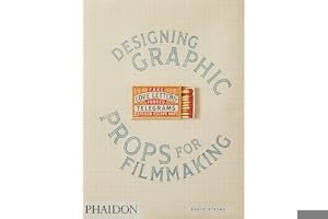
Fake Love Letters, Forged Telegrams, and Prison Escape Maps: Designing Graphic Props for Filmmaking
Annie Atkins
4.0
A behind-the-scenes look at the extraordinary and meticulous design of graphic objects for film sets
Although graphic props such as invitations, letters, tickets, and packaging are rarely seen close-up by a cinema audience, they are designed in painstaking detail. Dublin-based designer Annie Atkins invites readers into the creative process behind her intricately designed, rigorously researched, and visually stunning graphic props. These objects may be given just a fleeting moment of screen time, but their authenticity is vital and their role is crucial: to nudge both the actors on set and the audience just that much further into the fictional world of the film.
👏👏👏👏👏👏👏👏👏👏👏👏 @AnnieAtkins work is genuinely amazing (you'll have seen it on a screen somewhere near you) and a @Phaidon book is a major milestone in the work of any artist. Fair play 😎 https://t.co/qhPKEcyru2 [source]
Cover unavailable
76
Wolfgang Weingart: My Way to Typography
Wolfgang Weingart, K. Wolff, C. Schelbert
4.0
Both as a teacher and a designer, Wolfgang Weingart's influence on the development of typography since the 1970s is unparalleled. As the successor to Emil Ruder at the world-famous Schule fur Gestultung in Basel, he enhanced the rigor of Swiss Typography with experimental verve and creativity; he also put his innovative ideas to work for Typografische Monatsblutter. Countless designers in North America and Europe have been inspired by his teachings and lectures. In Typography, Weingart sums up an impressive lifework in 500 pages that describe his own development and the foundations of his teachings. This is a long-awaited book of epochal significance.
…
Cover unavailable
77
The Ultimate Guide to Modern Calligraphy & Hand Lettering for Beginners: Learn to Letter: A Hand Lettering Workbook with Tips, Techniques, Practice Pages, and Projects
June & Lucy
4.0
Cover unavailable
78
The Designer's Dictionary of Type
Sean Adams
4.0
The Designer’s Dictionary of Type follows in the footsteps of The Designer’s Dictionary of Color, providing a vivid and highly accessible look at an even more important graphic design ingredient: typography. From classic fonts like Garamond and Helvetica, to modern-day digital fonts like OCR-A and Keedy Sans, author and designer Sean Adams demystifies 48 major typefaces, describing their history, stylistic traits, and common application. Adams once again provides eye-catching illustrated examples, this time showcasing the beauty and expressiveness of typography, as employed by the world’s greatest designers. Organized by serif, sans-serif, script, display, and digital typefaces, this book will be a vital guide for designers, teachers, or students looking to gain a foundational understanding of the art, practice, and history of typography.
…
Cover unavailable
79
Modern Typography: An Essay in Critical History
Robin Kinross
4.0
Modern Typography, 2nd Edition is a completely updated and revised edition of Robin Kinross's classic survey of European and North American typography since 1700, first published in 1992. In addition to numerous new illustrations and revised text, Modern Typography has been re-scaled to a new, convenient pocket format. Kinross's overview breaks ground by focusing on the history of typography as an intricate web of social, technical, and material processes, rather than a parade of typeface styles. Eye magazine calls Modern Typography the book that tells "how modern typography got to be the way it is." Together, Kinross's clear, concise writing combined with his extensive knowledge of the history of typography create a gold standard for how design history ought to be written.
…
Cover unavailable
80
Shadow Type: Classic Three-Dimensional Lettering
Steven Heller, Louise Fili
4.0
Designers often look to the past for ways to enliven their projects. Letters with relief and shadow have long been an effective way to add spectacle or intrigue to otherwise mundane words. Introduced in metal type as early as 1815, shadow typefaces were a form of early experimentation among type founders. In the late nineteenth century, the form was adopted in wood type for use in posters and has been embraced ever since by designers looking for ways to communicate a sense of monumentality, a feeling of confidence, or a simple impression of optimism. Shadow Type presents a broad spectrum of examples—advertising, shop signs, billboards, posters, type-specimen books—featuring the most popular, rare, and (nearly) forgotten dimensional letters from Europe and the United States. Compiled by the leading historian of graphic design Steven Heller and renowned graphic designer Louise Fili, this invaluable collection, packed full of typographic ideas, will inspire anyone aiming to give more depth to their design.
…
Cover unavailable
81
FontBook
Erik Spiekermann, Jurgen Siebert, et al.
4.0
Cover unavailable
82
Handstyle Lettering: From Calligraphy to Typography
Viction Workshop
4.0
In our increasingly digital age, the compass, eraser, pencil and pen may seem like archaic choices for cutting-edge typography design; enter Handstyle Lettering, the latest from industry leader Viction:ary. Handstyle Lettering puts the best in contemporary hand-lettering on display with artist profiles as well as broad surveys of handcrafted typographic projects used for signage, logos, invitations and more. The on-trend pieces within exist at the intersection of art, typography and design; their creators help lend authenticity and style to corporate identities, or allow small brands and individual projects to distinguish themselves from competitors with elegance and flair. The collection is complemented with break-downs of calligraphic type and alphabet practice guides, making Handstyle Lettering a complete guide for designers searching for inspiration as well as for creators looking to hone their own hand-lettering techniques.
…
Cover unavailable
83
Modern Calligraphy: A Beginner's Guide to Pointed Pen and Brush Pen Lettering PLUS BONUS Tombow Fudenosuke Hard Tip Brush Pen
Leslie Tieu
4.0
Cover unavailable
84
Typography
Friedrich Friedl
4.0
An Encyclopedic Survey of Type Design and Techniques Throughout History. The most detailed and comprehensive survey and history of typography and alphabets ever undertaken, packed with 2,000 illustrations.
Cover unavailable
85
About Face: Reviving the Rules of Typography
David Jury
4.0
Cover unavailable
86
Designing Books: Practice and Theory
Jost Hochuli, Robin Kinross
4.0
Now available in paper, this newly revised and expanded classic in book design argues for a non-dogmatic approach, one open to both traditional and modern, and symmetrical and asymmetrical, solutions. A survey of Jost Hochuli's own work as a book designer featuring pages from a career of over 30 years is shown, along with detailed comments by noted designer and critic Robin Kinross. "Hochuli has achieved his standing without any fuss, programme or manifesto, by sheer talent and persistence. As a designer, his main concern is to work out individual solutions for individual books. This books is sure to help anyone who is seeking to develop a considered attitude towards the design and production of the book as a codex. The use of the individual's own understanding is at the core of Hochuli's practice and theory." Fernand Baudin, "Logos"
…
Cover unavailable
87
Thinking in Type: The Practical Philosophy of Typography
Alex W. White
4.0
With this visually stunning primer, designers will develop the skills and vision to produce truly innovative, eye-catching type design. All of the basics about type design are covered and in-depth information is provided on more advanced topics such as the differences between type applications, how typography creates identity, and what readers look for and respond to. Using more than 2,000 images from the 18th century up to the present day, this book can be used as a first exposure primer for students and as a reader for professionals.
Allworth Press, an imprint of Skyhorse Publishing, publishes a broad range of books on the visual and performing arts, with emphasis on the business of art. Our titles cover subjects such as graphic design, theater, branding, fine art, photography, interior design, writing, acting, film, how to start careers, business and legal forms, business practices, and more. While we don't aspire to publish a New York Times bestseller or a national bestseller, we are deeply committed to quality books that help creative professionals succeed and thrive. We often publish in areas overlooked by other publishers and welcome the author whose expertise can help our audience of readers.
…
Cover unavailable
88
Typography: My Way to Typography
Wolfgang Weingart
4.0
Since the 1970s Wolfgang Weingart has exerted a decisive influence on the international development of typography. In the late 1960s he instilled creativity and a desire for experimentation into the ossified Swiss typographical industry and reflected this renewal in his own work. Countless designers have been inspired by his teaching at the Basle School of Design and by his lectures. In Typography Weingart gives an unusual and frank narrative of his early life and development as a designer. For the first time he gives a comprehensive survey of his works over the past forty years, most of which are unknown.
…
Cover unavailable
89
Fonts & Logos: Font Analysis, Logotype Design, Typography, Type Comparison, and History
Doyald Young
4.0
Cover unavailable
90
Cat Says Meow: and other animalopoeia
Michael Arndt
4.0
Dog says woof . . . pig says oink . . . cow says moo. Animals and the sounds they make are paired up in playfully compelling ways in this eye-catching illustrated gift book featuring bold colors and an engaging use of onomatopoeia. Kids and parents will delight in discovering the ways in which the letters that spell out each animal's sound are key elements of that animal's illustration. With so much to see and to sound out, kids will relish this unique visual and educational experience, brimming with color and letters.
…
Cover unavailable
91
Make Life Your Bitch: Motivational adult coloring book. Turn your stress into success! (Midnight Edition)
John T
4.0
★ Turn Your Stress Into Success! ★Motivational adult coloring book to help you relax and relieve your stress!This swear word coloring book adult coloring book is jam-packed with motivational and inspirational coloring pages to help you relax, relieve your stress, and do a little bit of ass-kicking! Designs are made up of positive swear word quotes surrounded by cool and fun patterns.
★ Coloring pages designed to help you relieve stress and promote relaxation
★ Edgy motivational quotes help inspire you to achieve success
★ Printed single-sided so your colors don't bleed through and ruin designs on the back of the page
★ Printed on black backgrounds so your bright colors will pop
★ Makes a perfect gift for all occasions - think Mother's Day and White Elephant gift exchanges!
Adult coloring book fun!As you know, life isn't exactly easy. In fact, some days, weeks, months, and even years are tough. With such a constant and exhausting whirlwind of chaos, sometimes it's a wonder that moments of bliss still exist.
But life doesn't have to be this way. If there is only one life to live, you might as well take the hand you are dealt and do something with it. Right? Introducing Make Life Your Bitch. This adult coloring book is designed to help youcolor away your stress, take control of your life, and do a little bit of a**-kicking!
From the Creator of Humping Animals Coloring Book and the Rage Page Journal!John T is the author and creator of an assortment of swear word adult coloring books, puzzle books, and journals. These books are designed and illustrated to help you escape everyday stress and relax.
…
Cover unavailable
92
20th-Century Type
Lewis Blackwell
4.0
An updated and expanded edition of a classic book on 20th-century graphic design
Twentieth-Century Type surveysthe significant issues that have shaped the history and evolution of typography and graphic design, showing how current typographic trends are part of a continuously changing movement that can be plotted through the decades. Generously illustrated with over three hundred examples—more than two hundred of which are in color—the book charts significant topics including the arrival of mass-production; the birth of the art director; the appearance of the grid (and its subsequent rejection); the coming of non-print media; and the launch of the Macintosh computer and its ushering in of a new generation of designers enfranchised by digital technology.
This revised edition of a fundamental work brings the story up to date with new text and images covering type on screen and, in particular, type for the internet. Combining an assessment of the culture of experimentation in contemporary typographic design alongside a clear presentation of the field’s historical context, the book is an informed and accessible source for all students of design and for designers needing an expert overview of typography.
…
Cover unavailable
93
Letters of Credit: A View of Type Design
Walter Tracy
4.0
The revolution in typesetting - a revolution that over the past two decades has eliminated a five-hundred-year-old system of hot metal production and replaced it with one of photo-generated and computer-driven composition - shows no sign of winding down. This book, more than any other we know, traces the steps that went into that revolution and simultaneously makes the argument that the letter forms themselves are in process of evolution. Tracy argues that, whether they are of the sixteenth or the twentieth century, the forms that comprise our alphabet are subject to the same rules of good taste, proportion, and clarity that have always obtained. But what we face today is vastly different from fifty years ago. For the first time, new technology has made the proliferation (and, as some would maintain, debasement) of letter forms fast and easy (or quick and dirty.) With fifty years of professional experience on both sides of the Atlantic (including thirty years as head of type design for the British Linotype Company), Tracy is in a unique position to make this argument and arrive at his sad conclusion: the design of distinguished, contemporary typefaces is far outnumbered by the mediocre and downright bad. Part of the reason for this deplorable deterioration is a lack of critical analysis of the particular esthetics involved. This step-by-step examination of type-design esthetics is precisely what Tracy provides here, while avoiding both the promoter's hype and the manufacturer's claims. Here are the gut issues of what makes type good or bad, legible or unreadable. Extensively illustrated with both typefaces and line drawings, this book belongs on the shelf of anyone interested in thehistory of letters or in the artistry and peculiar problems that lie behind their production.
…
Cover unavailable
94
The Vignelli Canon
Massimo Vignelli
4.0
The famous Italian designer Massimo Vignelli allows us a glimpse of his understanding of good design in this book, its rules and criteria. He uses numerous examples to convey applications in practice - from product design via signaletics and graphic design to Corporate Design. By doing this he is making an important manual available to young designers that in its clarity both in terms of subject matter and visually is entirely committed to Vignelli's modern design.
…
Cover unavailable
95
Arcade Game Typography: The Art of Pixel Type
Toshi Omigari and Kiyonori Muroga
4.0
Arcade Game Typography presents readers with a fascinating new world of typography: the pixel typeface. Video game designers of the ’70s, ’80s, and ’90s faced color and resolution limitations that stimulated incredible creativity. With each letter having to exist in a small pixel grid, artists began to use clever techniques to create elegant character sets within a tiny canvas. This book presents typefaces on a dynamic and decorative grid, taking reference from high-end type specimens while adding a suitably playful twist. Arcade Game Typography recreates that visual aesthetic, fizzing with life and color.
Featuring pixel typefaces carefully selected from the first decades of arcade video games, Arcade Game Typography presents a completist survey of a previously undocumented outsider typography movement, accompanied by insightful commentary from author Toshi Omagari, a Monotype typeface designer himself. Gathering an eclectic range of typography, from hit games such as Super Sprint, Marble Madness, and Space Harrier to countless lesser-known gems, Arcade Game Typography is a vivid nostalgia trip for gamers, designers, and illustrators alike.
…
Cover unavailable
96
Indesign Type: Professional Typography with Adobe Indesign
Nigel French
4.0
Typography is the foundation of all graphic design. And if there's one sure way to improve as a graphic designer, it's to become more confident and more sophisticated in your use of type. This fully updated fourth edition is a comprehensive guide to creating professional type with Adobe InDesign. It covers micro and macro typography concepts, from understanding the nuance of a single spacing width to efficiently creating long and complex documents. InDesign Type shows not just how to use InDesign's extensive type features, but why certain approaches are preferable to others, and how to avoid common mistakes. Whether you're creating a single-page flyer or a thousand-page catalog, whether your documents will be printed or viewed on screen, InDesign Type is an invaluable resource for getting the most out of InDesign's typographic toolset. InDesign Type provides: - An exclusive focus on the typographic capabilities of InDesign - Complete coverage of macro and micro typography in InDesign - Clear, engaging explanations of the why and the how of good typography
…
Cover unavailable
97
Never Use Futura
Douglas Thomas and Ellen Lupton
4.0
Cover unavailable
98
U&lc: influencing design & typography
John Berry
4.0
Cover unavailable
99
Hand Lettering 101: An Introduction to the Art of Creative Lettering
Chalkfulloflove
4.0
UPDATE: We added Sarah's additional content in our latest print run!
If you follow Chalkfulloflove (also known as Sarah!) on social media, you and thousands of others already know how adorable her hand-lettered creations are. With Hand Lettering 101, Sarah brings her fabulous Hand Lettering 101 workshop right to you with this beginner workbook! In this book, you will go over the basics on how to learn Sarah's fun style of faux calligraphy. This book will guide you through each letter of the lower case alphabet, go over her technique behind connecting letters, give tips on how to mix and match your fonts, and finally lead you to make six finished projects! This is an introduction, so no experience is needed! Since practice is key, this gold spiral bound workbook lays flat and provides tons of opportunities for practice! Chalkfulloflove was created to encourage, inspire and make you giggle, so just pour yourself a cup of coffee or a glass of wine and settle in to start your own unique, adorable lettering creations!
Hand Lettering 101: An Introduction to the Art of Creative Lettering
Hardcover, oversized gold wire-o binding and gold corner protectors Step by step instructions on how to create various fonts and designs Thick premium paper, perfect for lettering Beautiful coffee table book and practical workbook
…
Cover unavailable
100
Super Simple Hand Lettering: Beautiful Hand Lettering for the Absolute Beginner
Kiley Bennett
4.0
Drawing beautiful letters by hand may seem intimidating, but it doesn't have to be! Discover how to transform simple words into stunning works of art with this easy introduction to hand lettering for absolute beginners. "Kiley in Kentucky" hand lettering expert Kiley Bennett gets you started right away with twenty traceable alphabets. She guides you through five skill-building projects to let you practice drawing each upper and lower case letter. This interactive workbook also provides 20 pages of quality vellum tracing paper, along with four frameable pullout art prints. Super Simple Hand Lettering is a valuable resource for any artist, whether you're a complete novice or an experienced designer looking to expand your technique. You'll learn to create your own unique lettering for everything from art journals and scrapbooks to greeting cards, gift tags, invitations, and more.